Checkbox field
CheckBoxFieldDefinition renders a single checkbox. It is a simpler
alternative to CheckBoxGroupFieldDefinition.
|
This checkbox field definition is part of the Magnolia 6 UI framework. The fully qualified class name is info.magnolia.ui.field.CheckBoxFieldDefinition. If you work with the Magnolia 5 UI framework, see Checkbox field for Magnolia 5 UI instead. |
Example definition
checkbox:
  $type: checkBoxField
  label: Show title
buttonLabel: Select checkbox to display title|
You can preview this example using the |
Field properties
Field-specific properties
| Property | Description |
|---|---|
|
required Label displayed next to the checkbox. The value is i18n-able. If you do not want to have any label, set the property to an empty string in YAML or in a message bundle. |
Common simple field properties
| Property | Description | ||||
|---|---|---|---|---|---|
|
required Name of the field definition item. Derived from the configured node name. Use alphanumeric characters without spaces. |
||||
|
required (unless Type of the field definition item. The value must be a fully qualified
class name and a subtype of |
||||
|
You can use this as a shortcut for Example class annotation
See Field types for possible values. |
||||
|
optional Property type of the field.
|
||||
|
optional Converts values between the presentation (UI) and model (stored data). The property must extend
|
||||
|
optional, default is translated Message shown when there is an error in the conversion process. The value can be literal or a key of a message bundle. |
||||
|
optional Pre-filled default value displayed in the field. The value can be overwritten by the user. Use alphanumeric characters.
|
||||
|
optional Help text displayed when the user clicks the help icon. The value can be literal or a key of a message bundle. |
||||
|
optional Defines the factory class that initializes and builds the Vaadin form field. The default factory class depends on the particular field. The value must be a fully qualified class name and a subtype of
|
||||
|
optional Defines the binder class that applies configuration parameters from the field. |
||||
|
optional, default is Enables i18n
authoring support, which allows editors to write foreign-language or
regionally targeted content. A two-letter language identifier ( |
||||
|
optional Field label displayed to editors. The value can be literal or a key of a message bundle. If you do not provide the property, Magnolia will fall back to a generated i18n key. If you do not want to have any label, set the property to an empty
string such as |
||||
|
optional, default is Makes the field uneditable. |
||||
|
optional, default is Makes the field required. When
|
||||
|
optional, default is translated Error message shown when |
||||
|
optional Additional style information for an editor property definition item applied to the element when the form is rendered. The value can be a CSS class or a list of CSS classes separated by white spaces. The style name will be rendered as an HTML class name, which can be used in a CSS definition.
The class name is added to the field by calling the Vaadin method
|
||||
|
optional List of field validator definition items. Any value must be a subtype of
See Field validators for more information. |
Example scenario
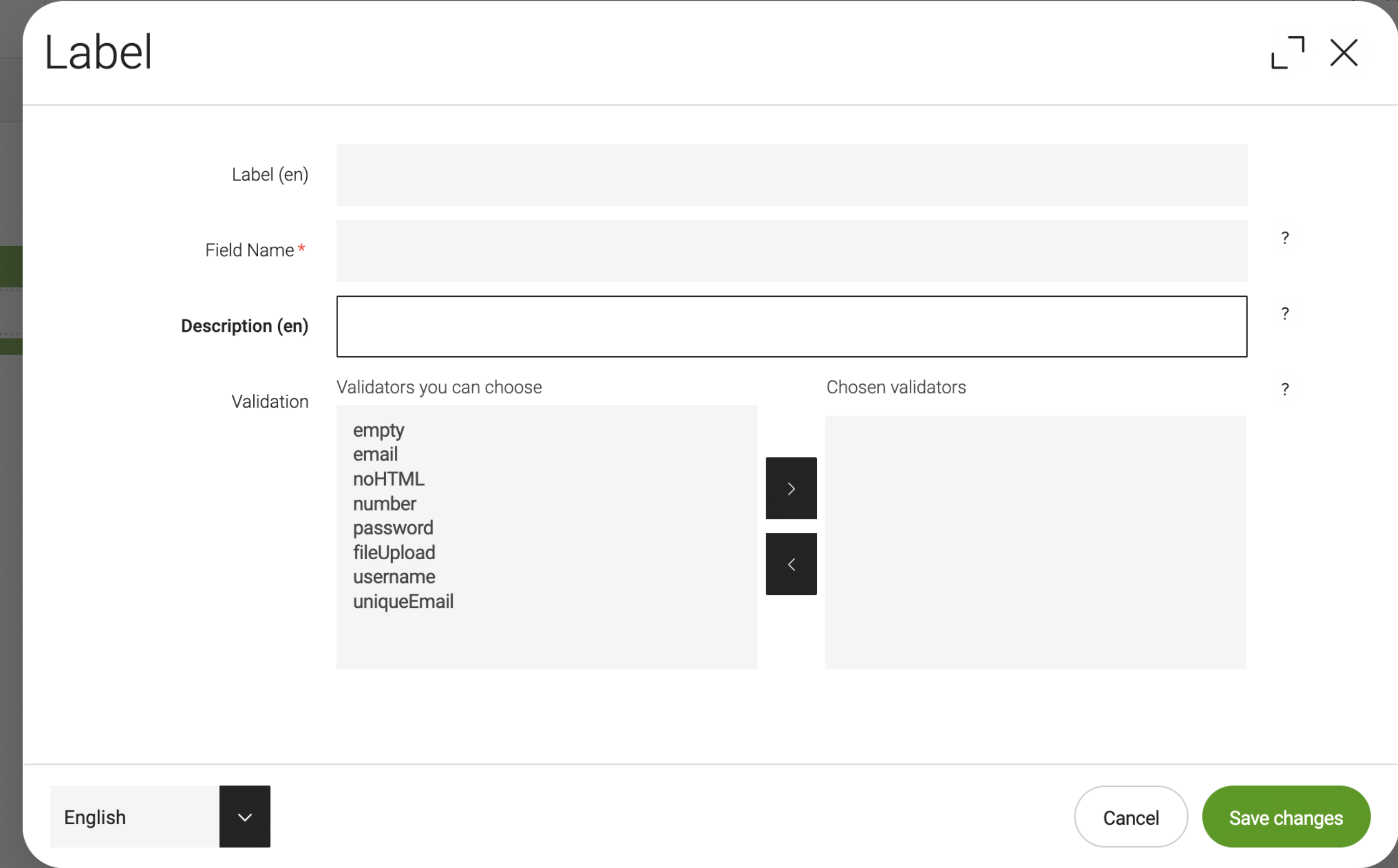
The formFile component enables developers to add an upload field to forms. Adding it would result in the following component dialog in the Pages app without any alteration to the out-of-the-box setup.

In some cases, you want to validate whether a file has been uploaded and display an error message if no file is uploaded when the completed form is submitted. A checkbox can be added to the template by using decorations. A walk-through of important aspects of this scenario is given below:
-
The YAML excerpt below adds a
formFileto the respective template’smainarea.... areas: main: availableComponents: formFile: id: form:components/formFile ... -
The
cms.areadirective in the FTL file calls the main area to be rendered in the excerpt below.... <div class="container"> [@cms.area name="main" /] </div> ... -
The
Labeldialog for theformFilecomponent at the beginning of this section does not need to be specified and is part of the Form module, which is bundled with both the community edition and DX Core. -
In order to add a checkbox to the dialog, a decoration YAML file is necessary in the light modules folder, such as the example shown below.
my-module/decorations/form/dialogs/formFile.yamlform: tabs: tabMain: fields: !override mandatory: type: Boolean class: info.magnolia.ui.form.field.definition.CheckboxFieldDefinition defaultValue: false name: mandatory validation: class: info.magnolia.ui.form.field.definition.TwinColSelectFieldDefinition path: /modules/form/config/validators repository: config -
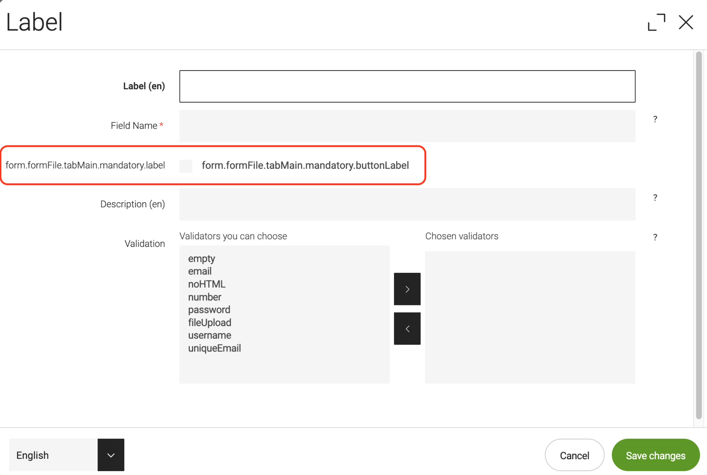
Adding the decoration creates a new field in the component dialog as shown below.

-
Use of model objects, for which all public methods of any Java model class may be accessed from template scripts, allows developers to check fields. For example, whether the field is valid and displaying the
requiredSymbolin the rendered form if themandatorycheckbox in its component dialog is selected. An example FTL snippet to do these checks and rendering is given below.my-module/templates/components/formFile.ftl... [#if !model.isValid()] <em>${i18n['form.error.field']}</em> [/#if] [#if content.mandatory!false] <dfn title="required">${model.requiredSymbol!}</dfn> [/#if] ...