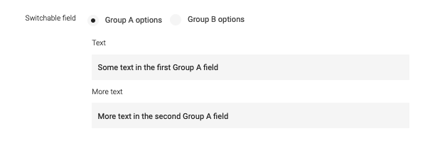
Switchable field
info.magnolia.ui.field.ConfiguredSwitchableFieldDefinition renders a complex field that displays alternative forms depending on user choice. Use the field to switch, for example, between:
-
Plain text and rich text editors.
-
Unauthenticated and authenticated SMTP settings.
-
Same and different addresses for shipping and billing.
|
This switchable field definition is part of the Magnolia 6 UI
framework. The fully qualified class name is
If you work with the Magnolia 5 UI framework, see Switchable field for Magnolia 5 UI instead. |
Example definition
switchable:
  $type: switchableField
  label: Foo or bar options
  field:
    $type: radioButtonGroupField
    layout: horizontal
    datasource:
      $type: optionListDatasource
      options:
        - name: foo
          label: Foo
          value: foo
        - name: bar
          label: Bar
          value: bar
  itemProvider:
    $type: jcrChildNodeProvider
  forms:
    - name: foo
      properties:
        foo:
          $type: textField
          label: Foo text
    - name: bar
      properties:
        bar:
          $type: richTextField
label: Bar rich text|
You can preview this example using the |
Field properties
Field-specific properties
| Property | Description | ||
|---|---|---|---|
|
required Node containing a select field and data source to switch between forms. As As
|
||
|
required List of forms to switch between. Forms define fields and similar components as well as their layout. See Form definition for more information. |
||
|
optional, default is A switchable field has different options, in which each option may have one or more fields. However, depending on the radio button selection, only one option is visible in the UI. An example switchable field is shown below.
If the |
||
|
optional, default is Decorates a property name for a node. |
Common complex field properties
| Property | Description | ||
|---|---|---|---|
|
required Name of the field definition item. Derived from the configured node name. Use alphanumeric characters without spaces. |
||
|
required (unless Type of the field definition item. The value must be a fully qualified
class name and a subtype of |
||
|
You can use this as a shortcut for Example class annotation
See Field types for possible values. |
||
|
required, default is
Node with a For more details, see Item providers.
|
||
|
optional Help text displayed when the user clicks the help icon. The value can be literal or a key of a message bundle. |
||
|
optional, default is Enables i18n authoring support, which allows editors to write foreign-language or regionally targeted content.
A two-letter language identifier (
|
||
|
optional Field label displayed to editors. The value can be literal or a key of a message bundle. If you do not provide the property, Magnolia will fall back to a generated i18n key. If you do not want to have any label, set the property to an empty
string such as |
||
|
optional Additional style information for an editor property definition item applied to the element when the form is rendered. The value can be a CSS class or a list of CSS classes separated by white spaces. The style name will be rendered as an HTML class name, which can be used in a CSS definition.
The class name is added to the field by calling the Vaadin method
|
