Link field
LinkFieldDefinition renders a
text
field and a browse button that allows you to select an item from any
data source. It
extends info.magnolia.ui.field.ComboBoxFieldDefinition.
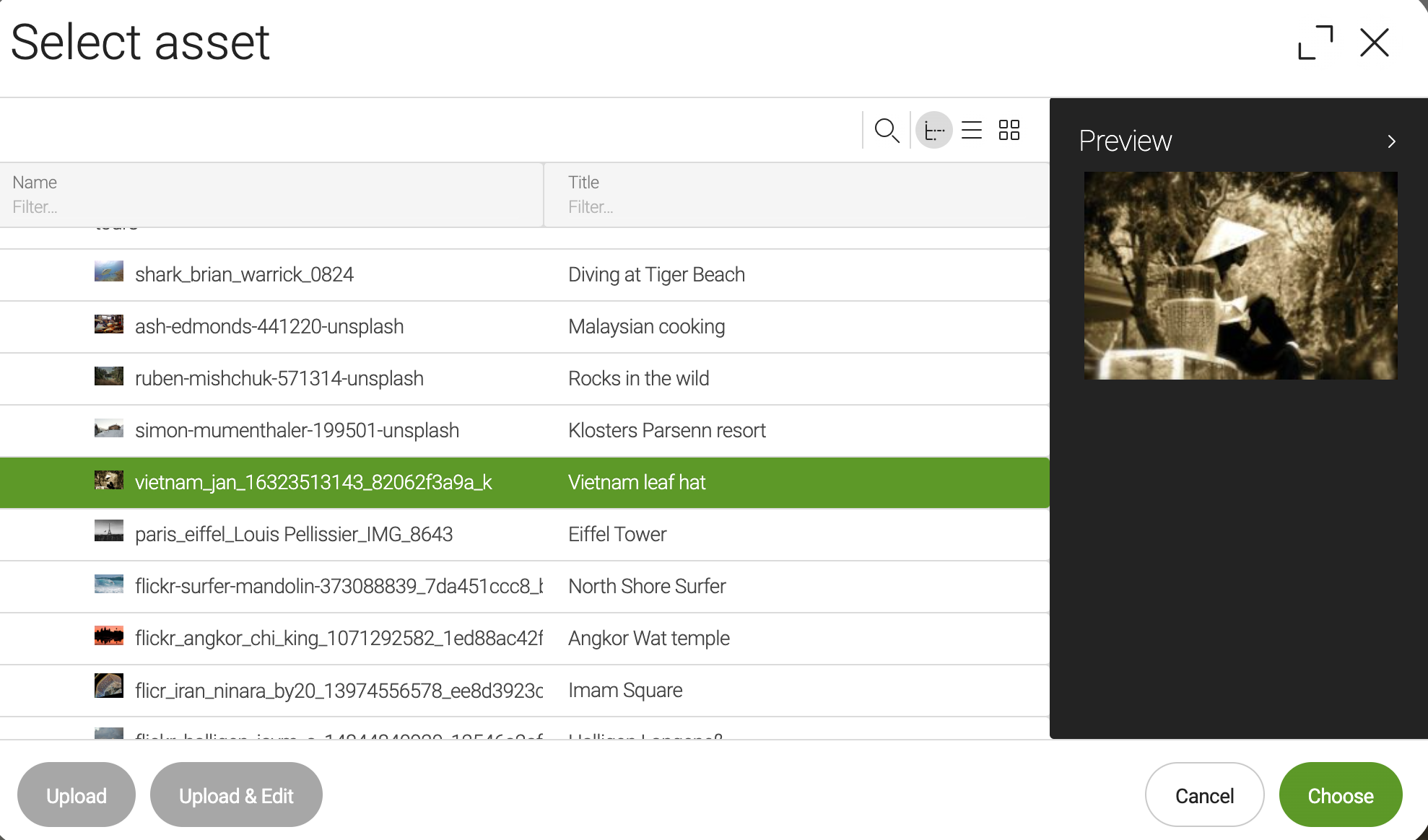
The link field is used to select targets both inside and outside Magnolia (for example, an asset to render an image or a page to tease) where it stores a reference to the selected item.
Magnolia provides four preconfigured link field definitions:
-
DamLinkFieldDefinition: links to an asset or folder (damLinkField). -
info.magnolia.pages.app.field.PageLinkFieldDefinition: links to a page (
pageLinkField). -
info.magnolia.resources.app.field.ResourceLinkFieldDefinition: links to a resource (
resourceLinkField). -
info.magnolia.rest.ui.field.linkfield.JsonLinkFieldDefinition: links to a JSON node (
jsonLinkField).
|
These link field definitions are part of the Magnolia 6 UI framework. Their fully qualified class names are:
If you work with the Magnolia 5 UI framework, see Link field for Magnolia 5 UI instead. |
Remember My Last Location
Link fields by default memorize the most recent selection per HTTP session.
For example, when you create or edit a Page in Magnolia, you select the Text and Image component to add a photo to your page. You select an image from the Assets Chooser dialog, and the selector memorizes your last selected image across the stories and content apps.
The Remember My Last Location functionality applies to all types of link fields in your current browser tab. The last location is remembered throughout different Magnolia apps according to the chooserId of your link field. Once you close your current browser tab, the status is restored and the most recent selection is reset.
If you want to customize this behavior in a custom range of fields for the same type you can do so by defining your chooserId for the linkField.
Example definitions
link:
  $type: linkField
  label: Link
  datasource:
    $type: jcrDatasource
    workspace: website
image:
$type: damLinkField
label: Image
description: Choose an image
datasource:
$type: assetDatasource
workspace: dam
rootPath: /a/a2
allowedNodeTypes:
- mgnl:folder
- mgnl:asset
You can control the range of images available in the chooser dialog using the rootPath property.
|
pageLink:
  $type: pageLinkField
  label: Page link
  showOptions: true
  textInputAllowed: true
  filteringMode: CONTAINS
  converterClass: info.magnolia.ui.editor.converter.JcrNodeToPathConverter
externalLinkOrPageLink:
$type: pageLinkField
label: External link or page link
# textInputAllowed=true and showOptions=false (default) allow you to set any value (for example, an external link)
textInputAllowed: true
filteringMode: CONTAINS
# this is the default chooser; you can configure your own with more or fewer columns
chooserId: ui-framework-jcr:chooserresourceLink:
$type: resourceLinkField
label: Resource link
showOptions: true
textInputAllowed: true
filteringMode: CONTAINSjsonLink:
$type: jsonLinkField
label: Nobel prize winner
showOptions: true
textInputAllowed: true
filteringMode: CONTAINS
chooserId: field-examples-module:components/json-chooser
datasource:
name: rest
$type: jsonDatasource
restClient: nobelprize
restCall: allPrizes
jsonPathExpressions:
itemId: '$.en'
items: '$.nobelPrizes[*].laureates[*].fullName'
describeBy: '$.en'|
You can preview this example using the |
Field properties
Field-specific properties
| Property | Description | ||||
|---|---|---|---|---|---|
|
optional, default is Unique identifier for the
chooser
dialog. If none is specified, the
JCR
|
||||
|
optional, default is When
See also below a note about the S3 assets (listing and choosing them). |
||||
|
optional, default is translated Button label for selecting a new target. The value is i18n-able. |
||||
|
optional, default is When |
||||
|
optional Renders a preview of the selected content. The preview component typically displays an image thumbnail and some metadata. |
||||
|
required Any class that implements the
|
Common combobox field properties
| Property | Description |
|---|---|
|
optional, default is Defines whether the user can select nothing in the field. When |
|
optional, default is empty string When |
|
optional, default is Sets the number of items in the field pop-up. The value must be between |
|
optional Placeholder text to be displayed when the field is empty. The value is i18n-able. |
|
optional Sets the width of the field pop-up relative to the field itself. If no value is specified, the pop-up’s width will automatically expand to fit the content of all displayed items. |
|
optional, default is Defines whether the selected item is always scrolled into view when the comboBox pop-up has multiple pages. Possible values are It’s useful for users who want automatic scrolling to the selected item, especially when the selected item is not shown in the pop-up’s first pages and the pop-up has several pages between which the user can scroll up and down. But be aware: setting |
|
optional, default is When When |
Common select field properties
| Property | Description | ||
|---|---|---|---|
|
required Connects the field to a data source. Options are populated via the configured data source. Use the fully qualified class name or the |
||
|
optional, default is Defines how options are filtered. Other possible values are
|
Common simple field properties
| Property | Description | ||||
|---|---|---|---|---|---|
|
required Name of the field definition item. Derived from the configured node name. Use alphanumeric characters without spaces. |
||||
|
required (unless Type of the field definition item. The value must be a fully qualified
class name and a subtype of |
||||
|
You can use this as a shortcut for Example class annotation
See Field types for possible values. |
||||
|
optional Property type of the field.
|
||||
|
optional Converts values between the presentation (UI) and model (stored data). The property must extend
|
||||
|
optional, default is translated Message shown when there is an error in the conversion process. The value can be literal or a key of a message bundle. |
||||
|
optional Pre-filled default value displayed in the field. The value can be overwritten by the user. Use alphanumeric characters.
|
||||
|
optional Help text displayed when the user clicks the help icon. The value can be literal or a key of a message bundle. |
||||
|
optional Defines the factory class that initializes and builds the Vaadin form field. The default factory class depends on the particular field. The value must be a fully qualified class name and a subtype of
|
||||
|
optional Defines the binder class that applies configuration parameters from the field. |
||||
|
optional, default is Enables i18n
authoring support, which allows editors to write foreign-language or
regionally targeted content. A two-letter language identifier ( |
||||
|
optional Field label displayed to editors. The value can be literal or a key of a message bundle. If you do not provide the property, Magnolia will fall back to a generated i18n key. If you do not want to have any label, set the property to an empty
string such as |
||||
|
optional, default is Makes the field uneditable. |
||||
|
optional, default is Makes the field required. When
|
||||
|
optional, default is translated Error message shown when |
||||
|
optional Additional style information for an editor property definition item applied to the element when the form is rendered. The value can be a CSS class or a list of CSS classes separated by white spaces. The style name will be rendered as an HTML class name, which can be used in a CSS definition.
The class name is added to the field by calling the Vaadin method
|
||||
|
optional List of field validator definition items. Any value must be a subtype of
See Field validators for more information. |
Default values for preconfigured link fields
You can set defaultValue for preconfigured link fields as follows:
damLinkUUID:
  $type: damLinkField
  defaultValue: jcr:57ad85f2-e794-44a7-814f-271a51f41c26 # UUID with a prefix
pageLinkPath:
$type: pageLinkField
defaultValue: /Field-examples # path
pageLinkUUID:
$type: pageLinkField
defaultValue: a6ec3630-2701-4993-8372-18dc70f99b3e # UUIDresourceLinkPath:
$type: resourceLinkField
defaultValue: /Field-examples # pathjsonLinkString:
$type: jsonLinkField
defaultValue: 'Pieter Zeeman' # stringAdditional usage notes
Restrict damLinkField to assets only
To restrict damLinkField to assets only, see the commented-out lines in the
DAM chooser.
S3 assets
S3 assets cannot be listed and selected in the combobox field with showOptions: true.
In such cases, S3 assets need to be selected via the chooser.