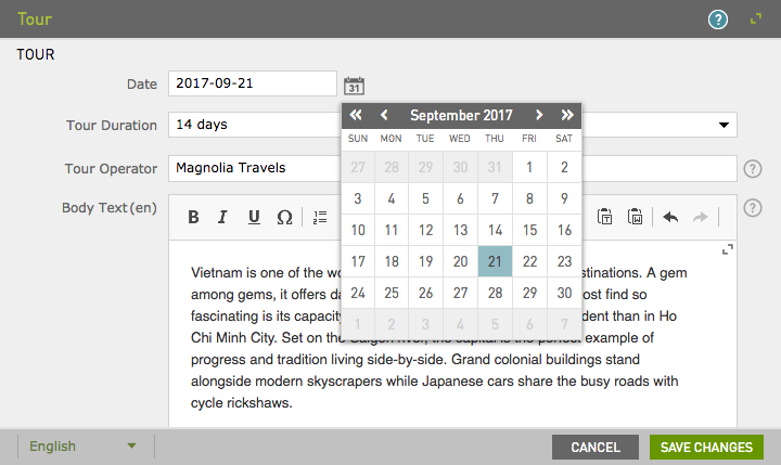
Date field - 5 UI
Deprecated
|
This date field definition has been deprecated since Magnolia 6.0. It is part of the Magnolia 5 UI framework. For the updated implementation, see Date field for Magnolia 6 UI instead. |
DateFieldDefinition renders a calendar that allows the user to select a date and optionally
a time.
class: info.magnolia.ui.form.field.definition.DateFieldDefinition
fieldType: date

Date field properties
Simple date field
form:
  tabs:
    - name: tabText
      label: Text
      fields:
        - name: date
          fieldType: date
          time: false
          type: Date
          label: Date
          defaultValue: now
Referencing fields shortcut info - 5 UI
See Referencing fields for further information.
| Property | Description | ||
|---|---|---|---|
|
|||
|
required Set the |
||
|
optional, default is `yyyy-MM-dd` Format in which the date is displayed to users. See SimpleDateFormat class for allowed patterns. Examples: |
||
|
optional, default is `now` Set the default value to a specific date such as The default value only applies to new content items, not to existing content items that have been created previously.
If you define the |
||
|
optional, default is Enables time selection. Renders dropdown boxes at the bottom of the calendar. |
||
|
optional, default is `HH:mm` Format in which time is displayed to users. See SimpleDateFormat class for allowed patterns. Examples: |
Common field properties - 5 UI
| Property | Description | ||
|---|---|---|---|
|
required Defines the field type via either a field alias name or a fully-qualified field definition class name. See Field definition: Field types. To check the correct form of the name, use the Definitions app. |
||
|
optional Pre-filled default value displayed in the field. The value can be overwritten by the user. Use alphanumeric characters.
|
||
|
optional Help text displayed when the user clicks the help icon. The value can be literal or retrieved from the message bundle with a key. Use alphanumeric characters in literal values. Not applicable to the static field. |
||
|
optional, default is Enables i18n
authoring support which allows editors to write foreign-language or
regionally targeted content. A two-letter language identifier (en, de,
fr etc.) is displayed on controls where |
||
|
optional, default is the message bundle defined in the dialog definition_ Message bundle such
as |
||
|
optional Field label displayed to editors. The value can be literal such as
If you do not provide the property, Magnolia will fall back to a generated i18n key and display the key in the UI. If you do not want a label at all, define the property and set its value
to a blank space such as |
||
|
optional, default is the name of the field’s parent node_ Name of the node where the value is saved. The name |
||
|
|||
|
optional, default is Makes the field uneditable. Adding this property has the same effect as creating a static field. |
||
|
optional, default is Makes the field required (mandatory). An asterisk is displayed next to the field label. See also Checking for null values. |
||
|
optional, default is Error message displayed when required is true and the user saves an
empty field. The value can be literal or retrieved from the
message bundle with
a key such as |
||
|
optional Adds one or more style names to this component. Multiple styles can be
specified as a space-separated list of style names such as
|
||
|
optional Property transformer classes define how field values are stored in the repository. Each field has a default transformer class. You don’t need to define a class unless you want to override the default. The value is a fully-qualified class name.
|
||
|
optional, most fields set a default value automatically JCR property type of the stored value such as |