Accessible forms (tech preview)
|
This is a technical preview of the Accessible forms feature, do not use in production. We encourage you to try the technical preview or read about it and share your experience, impressions and inputs with us at feedback@magnolia-cms.com. ⚠️ A production-ready version of accessible forms will only be available for Magnolia 6.4 and later, not for the Magnolia 6.3 branch. |
Magnolia is developing a new UI based on front-end technology (React) and a custom front-end design system built from the ground up for accessibility.
Magnolia’s accessible forms and design system support equal access for everyone. They offer a modern design and help you build more readable, consistent, performant, and usable forms. Furthermore, it preserves your current features and improves their accessibility.
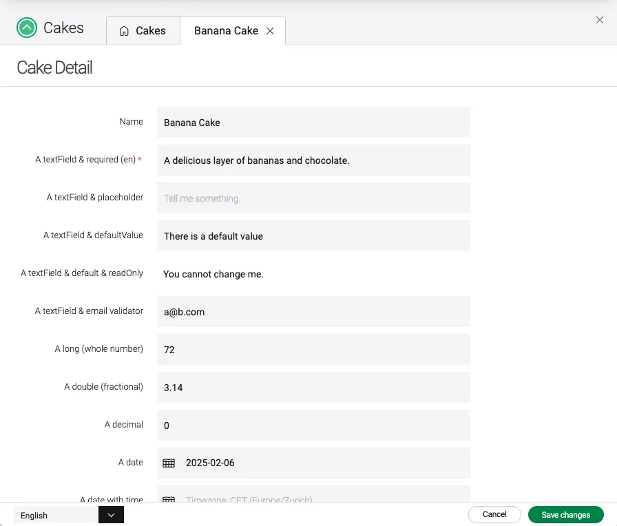
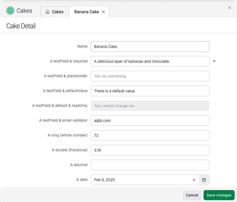
| Vaadin form | New Accessible form |
|---|---|
|
|
Viewing accessible forms
Accessible forms use the existing Magnolia form definitions but don’t support every field or every property.
When a form definition is fully supported, the new accessible form is displayed.
Otherwise, the system will fall back to the standard Vaadin form.
In this case, problems are shown in the Definitions app to indicate which features aren’t supported in the new UI.
Set the new Problem type filter to UNSUPPORTED or IGNORED to see them.
Support for more fields is in development, but not all of the current behavior will be supported. To streamline the product, we’ll remove some rarely used features. See Current and planned support for more details.
How to try accessible forms
There are a few different options to get started with the new forms.
Watch a video
Watch a 10-minute overview of the Accessible forms in action.
Live demo
Email us at feedback@magnolia-cms.com to book a live demo, and share your feedback with us directly.
Local installation
The feature requires Magnolia 6.4.0-beta1.
We recommend one of the following installation routes.
-
Build with Maven
-
Create a
6.4.0-beta1DX Core custom webapp. Thewarp-formsis included automatically together with the DX Core dependencies. -
Run the created webapp in a Jakarta-compatible Tomcat (
10.1.43+).
-
-
Install the released Tomcat bundle
-
Download a full webapp bundled with the Tomcat:
This option requires a DX Core license. -
Sign in to Magnolia Nexus.
-
Download and install the magnolia-dx-core-webapp-6.4.0-alpha1-tomcat-bundle (ZIP archive).
-
-
Add the demo project and try it out
There’s a demo project called demo-warp-forms, which demonstrates all of the features so far implemented in Accessible forms.
-
Download the demo project and copy the
demo-warp-forms-lmdirectory into your configuredmagnolia.resources.dirdirectory (into thelight-modulesdirectory). -
Start your Magnolia instance.
-
Open the Cakes app and create a new item to try out the Accessible forms.
Possible issues in the beta1
Determine why a form is displaying Vaadin forms
Are you seeing Vaadin forms instead of the new Warp forms?
-
Open the Definitions app, and switch to the Problems subapp.
-
Use the new Problem type filter and choose
UNSUPPORTED. -
You will now see the problems causing the form to display the Vaadin form.
See Current and planned support for details on which features we still plan to support in the future.
Check which properties are being ignored
Open the Definitions app, and switch to the Problems subapp.
Use the new Problem type filter and choose IGNORED.
If it’s important for you that these properties are used in the form and not ignored, you can force a form to be displayed in Vaadin by setting the $type of the form to vaadinForm.
...
    detail:
        label: My App detail
        form:
            $type: vaadinForm
            properties:
...
See Current and planned support for a full list of which properties are ignored.
See all the problems of a form
In the Problems subapp, only the first problem of each definition is displayed. To see all the problems of a form, check the checkbox on the left to select the problem and use the Export problems action in the Action bar. A text file will be exported.
Use Accessible forms and Vaadin forms in parallel
Even once the Accessible forms feature is released, not every form will be supported due to the many custom fields included in extensions or customer projects. There will be a transition period. You can continue to use Vaadin forms and upgrade them to Accessible forms as appropriate.
Current and planned support
This section outlines which standard Magnolia fields and related features are supported in the new UI.
Standard form fields supported
The standard fields are described in the Field definition section of the Magnolia documentation.
| Supported fields | Fields not yet fully supported |
|---|---|
jcrMultiLinkField (renders as jcrMultiField) |
|
tokenField (renders as comboBoxField) |
|
twinColSelectField (renders as comboBoxField) |
|
|
The fields from the Magnolia Extensions and custom fields are not yet supported. |
Features not yet supported
For the standard fields, several features aren’t supported yet:
-
Editing multi-language content.
-
Page editor dialogs.
-
Reordering items in a multiField.
-
Supplying a custom fieldType.
-
Tabs.
-
The richTextField editor doesn’t have Magnolia plugins.
| Form layouts are not supported as they lack the flexibility of previous versions and therefore are not even planned for future development. |