Twin-column field - 5 UI
Deprecated
|
This twin-column field definition has been deprecated since Magnolia 6.0. It is part of the Magnolia 5 UI framework. For the updated implementation, see Twin-column field for Magnolia 6 UI instead. |
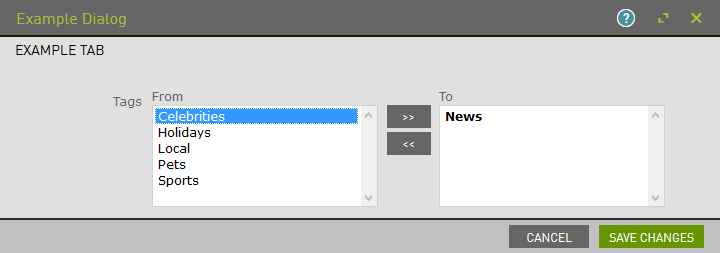
TwinColSelectFieldDefinition renders two boxes side by side.
Available items are in the left box and selected items in the
right box. To select an item, move it from left to right.
This control is useful for selecting large sets of items such as group and role memberships. You can find an example in the Security app.
class:
info.magnolia.ui.form.field.definition.TwinColSelectFieldDefinition
fieldType: twinColSelect
Twin-column field properties
Simple twin-column field definition:
form:
 tabs:
    - name: tabTags
      label: Tags
      fields:
        - name: tags
          fieldType: twinColSelect
          type: String
          label: Tags
          options:
            - name: news
              label: News
              selected: true
            - name: sports
              label: Sports
              value: sports
            - name: celebrities
              label: Celebrities
              value: celebrities
Referencing fields shortcut info - 5 UI
See Referencing fields for further information.
Common select field properties - 5 UI
The select, option group and twin-column fields share this general configuration pattern, but they also have their own additional properties.
<field name>
required
Name of the field.
options
optional
Parent node for the selectable options. If not set, the field generates options from the repository path.
<option name>
Name of the option.
value
required
Value saved to the repository when selected.
name
optional, default is the parent node name
Name of the node where the selected value is stored. If not set, the name of the parent node is used.
label
optional
Option label displayed to the user.
iconSrc
optional
Displays an image next to the option. Value is a path to the image.
selected
optional, default is false
Pre-selects the option.
labelProperty
optional, default is `label`
Reads option labels from a different property. Set to the name of your custom label node.
path
optional
Path to existing options as opposed to defining options in the current definition. Only valid with a field defined in XML.
Alternatively, option definitions can be placed in a YAML file
referenced via include.
repository
optional, default is `RepositoryConstants.CONFIG`
When using a path to existing options, workspace to look in.
sortOptions
optional, default is true
By default, option labels are sorted alphabetically. When false, sorts
the options by JCR node order.
comparatorClass
optional, default is `info.magnolia.ui.form.field.factory.SelectFieldFactory.DefaultOptionComparator`
When sortOptions set to true, sorts the available options.
valueProperty
optional, default is value
Reads option values from a different property. Set to the name of your custom value node.
+ Properties specific to the twin-column field.
| Property | Description |
|---|---|
|
Name of field. |
|
optional, default is Text displayed above the left column. Typically retrieved from a message bundle. |
|
optional, default is Text displayed above the right column. Typically retrieved from a message bundle. |
Common field properties - 5 UI
| Property | Description | ||
|---|---|---|---|
|
required Defines the field type via either a field alias name or a fully-qualified field definition class name. See Field definition: Field types. To check the correct form of the name, use the Definitions app. |
||
|
optional Pre-filled default value displayed in the field. The value can be overwritten by the user. Use alphanumeric characters.
|
||
|
optional Help text displayed when the user clicks the help icon. The value can be literal or retrieved from the message bundle with a key. Use alphanumeric characters in literal values. Not applicable to the static field. |
||
|
optional, default is Enables i18n
authoring support which allows editors to write foreign-language or
regionally targeted content. A two-letter language identifier (en, de,
fr etc.) is displayed on controls where |
||
|
optional, default is the message bundle defined in the dialog definition_ Message bundle such
as |
||
|
optional Field label displayed to editors. The value can be literal such as
If you do not provide the property, Magnolia will fall back to a generated i18n key and display the key in the UI. If you do not want a label at all, define the property and set its value
to a blank space such as |
||
|
optional, default is the name of the field’s parent node_ Name of the node where the value is saved. The name |
||
|
|||
|
optional, default is Makes the field uneditable. Adding this property has the same effect as creating a static field. |
||
|
optional, default is Makes the field required (mandatory). An asterisk is displayed next to the field label. See also Checking for null values. |
||
|
optional, default is Error message displayed when required is true and the user saves an
empty field. The value can be literal or retrieved from the
message bundle with
a key such as |
||
|
optional Adds one or more style names to this component. Multiple styles can be
specified as a space-separated list of style names such as
|
||
|
optional Property transformer classes define how field values are stored in the repository. Each field has a default transformer class. You don’t need to define a class unless you want to override the default. The value is a fully-qualified class name.
|
||
|
optional, most fields set a default value automatically JCR property type of the stored value such as |