Developing a custom content editor app
This page describes how to develop a custom content editor app based on the Magnolia Content editor.
|
Compatibility note Custom content editor and block definitions created in the Magnolia 5 UI framework must be migrated. |
Before you start
This section mentions what you should be aware of before creating an implementation of the content editor.
Understanding the content model: block, composition
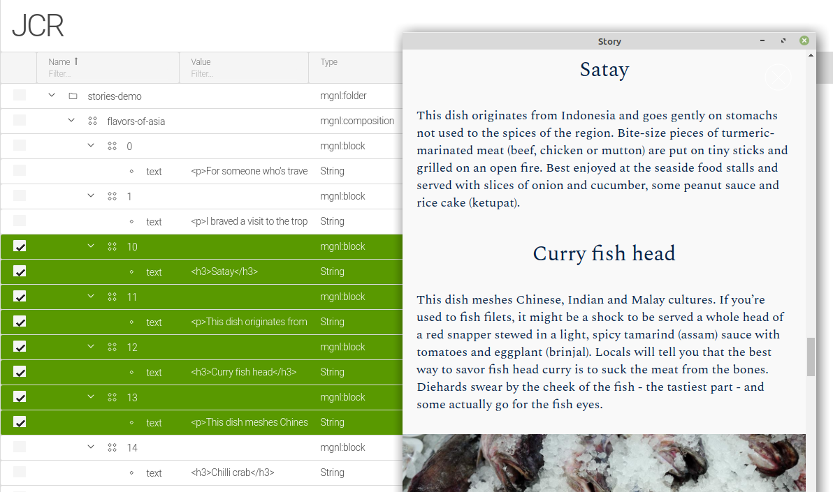
A block is a well-defined page section which, together with other blocks and additional meta information, can form a single content composition.
In the context of the content editor app, each item (e.g. a story in the stories-app) is a composition of N blocks of editable content, such as headings and paragraphs, complemented by meta information such as the required fields for the lead and title of the story:
Declaring the ContentClipboard component
When creating a custom content editor app, you must ensure that you declare the ContentClipboard in the proper scope. In other words, you need to make sure the id reflects your particular custom app.
This should be as part of the <components> in your XML-based module descriptor.
|
  <components>
    <id>app-my-stories-browser</id> (1)
    <component>
      <type>info.magnolia.ui.framework.ContentClipboard</type>
      <implementation>info.magnolia.ui.contentapp.action.clipboard.JcrClipboard</implementation>
    </component>
</components>| 1 | Declaring the custom app. The format is app-<YOUR-APP-NAME>-browser. In this example, the app is called my-stories. |
Required node types
The content editor UI expects nodes of the type mgnl:block, mgnl:composition and mgnl:collection. These node types are defined in the file content-editor-nodetypes.cnd which resides in the magnolia-content-editor submodule.
Hoewever, registration of these node types is handled by the stories-app via the XML-based module descriptor.
Dependencies on the content editor modules
In any case, your implementation of the content editor depends on the following modules:
-
magnolia-content-editor -
magnolia-block-api -
magnolia-block-templating
Besides the requirement for these base modules, you must also ensure that the system registers the required node types.
If your custom content editor is created with a light module, your bundle must contain the stories-app module. If created with a Magnolia Maven module, you can register the node types within your custom module.
|
If you are using a preconfigured DX Core webapp or bundle (see the list of preconfigured Magnolia bundles), it already contains the |
Workspace
To store new content items with your custom content editor, you can use
-
the
storiesworkspace provided by thestories-appmodule, -
or a custom workspace defined by your custom module.
Defining a custom content editor app
Developing a custom content editor app is similar to creating any other 6 UI app because it is based on the info.magnolia.ui.framework.app.BaseApp app class.
|
You can build your custom content editor app within a light module. |
Here is an overview how to define a content editor app:
-
Create a YAML app descriptor with its subapps.
-
The browser subapp is just a browser descriptor from the UI (
info.magnolia.ui.contentapp.configuration.BrowserDescriptor). -
The detail subapp should extend
info.magnolia.editor.app.ContentEditorDetailSubApp.
Creating the descriptor and subapps
Create a YAML app descriptor.
Typically, you need at least the following two subapps:
-
The browser subapp. Use a regular browser descriptor class
info.magnolia.ui.contentapp.configuration.BrowserDescriptor. -
The editor subapp. Use
info.magnolia.editor.app.ContentEditorDetailSubApp, which extendsinfo.magnolia.editor.app.ContentDetailSubApp.- Action definitions
-
    actions:
      close:
        class: info.magnolia.editor.action.CloseContentEditorActionDefinition
      save:
        class: info.magnolia.editor.action.SaveContentActionDefinition
      saveAndPublish:
        class: info.magnolia.editor.action.SavePublishContentActionDefinition
Using mgnl:composition in the app descriptor
Set the mgnl:composition node type:
-
As one of the allowed node types of your app:
datasource:
  $type: jcrDatasource
  workspace: <workspace-name>
  allowedNodeTypes:
    - mgnl:composition
    - mgnl:folder
(Instead of
<workspace-name>, usestories,articlesor the name of your custom workspace.) -
As the primary node in the dropConstraint in a content view of the browser subapp:
browser: class: info.magnolia.ui.contentapp.configuration.BrowserDescriptor workbench: contentViews: - name: tree $type: treeView dropConstraint: $type: jcrDropConstraint primaryNodeType: mgnl:composition columns: - name: jcrName $type: jcrTitleColumn nodeTypeToIcon: mgnl:folder: icon-folder -
As node types for the datasource and item provider in the detail subapp:
  editor:
    class: info.magnolia.ui.contentapp.detail.DetailDescriptor
    subAppClass: info.magnolia.editor.app.ContentEditorDetailSubApp
    datasource:
      $type: jcrDatasource
      workspace: stories
      allowedNodeTypes:
        - mgnl:composition
        - mgnl:folder
    itemProvider:
      $type: jcrNodeFromLocationProvider
      nodeType: mgnl:composition
Creating a composition of fields and blocks
You can use a combination of the following field types to create a composition of editable elements for your editor form:
-
Expanding text field
-
type alias:
expandingTextField -
class:
info.magnolia.editor.app.field.ExpandingTextFieldDefinition
-
-
Collapsible composite field
-
type alias:
collapsibleCompositeField -
class:
info.magnolia.editor.app.field.CollapsibleCompositeFieldDefinition
-
-
Multi block (a set of blocks). The developer of the editor defines what block types will be available to the editor. The actual number of blocks added and their mutual position is determined by the editor.
-
type alias:
multiJcrBlock -
class:
info.magnolia.editor.block.jcr.MultiJcrBlockDefinition
-
Example collection
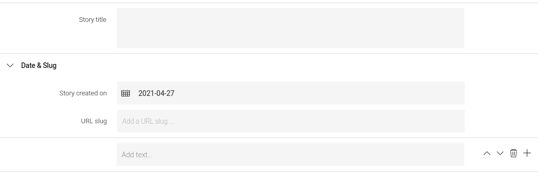
The following definition creates a collection consisting of four editable elements:
-
A two-row title field (
title). -
A composite field (
datesAndSlug) for:-
Story date.
-
URL slug of the story.
-
-
A multi block (
blocks) that can hold multiple instances of block typestextandimage.
    form:
      properties:
        title:
          $type: expandingTextField
          label: Story title
          rows: 2
        datesAndSlug:
          $type: collapsibleCompositeField
          label: Date & Slug
          collapsed: false
          itemProvider:
            $type: currentItemProvider
          properties:
            created:
              $type: dateField
              label: Story created on
              defaultValue: now
            jcrName:
              $type: slugField
              label: URL slug
              placeholder: Add a URL slug ...
        blocks:
          $type: multiJcrBlock
          blocks:
            - text
            - image
          initialBlock: text
          defaultBlock: image
          itemProvider:
$type: currentItemProvider- Rendered as
-
The multi block
An editor node defined using multiJcrBlock creates a block set and specifies what block types are allowed in it and their appearance.
The Content Editor module comes with four predefined types of block you can use in your editor:
-
text -
image -
video -
externalLink
You can also define your own content block(s).
Multi block properties
initialBlock
Specifies what will be created as the initial, automatically added block when creating new content (or when no block is available). Example:
initialBlock: textdefaultBlock
Defines the block type which will be pre-selected in the block picker dialog. Example:
defaultBlock: image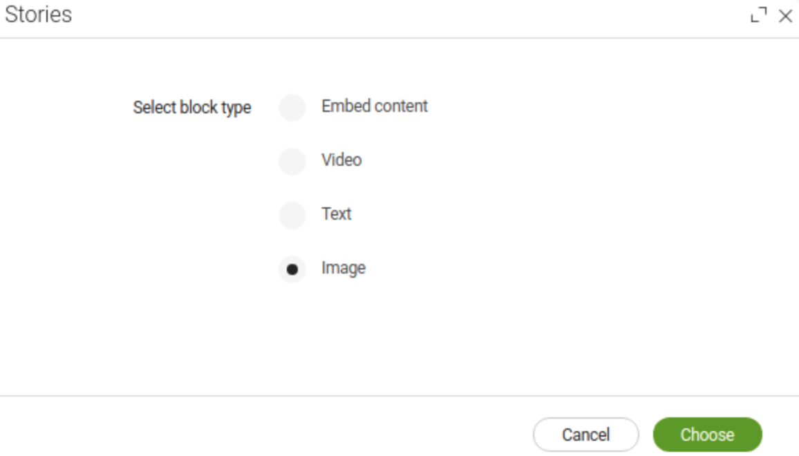
linkableApps
Defines the app(s) whose resources you can link to from the text block. Example:
linkableApps:
  - pages
  - assets
  - contacts
Content internationalization (i18n)
Internationalization (i18n) of content is supported since version 2.1 of the Content Editor module. Block definitions and data structures created in the older versions of the module must be migrated.
Compatibility of content and block definitions
Flat vs nested content structure
The data model has changed for internationalized stories. Whereas in versions 1.3.x and 2.0.x of the module, the mgnl:block elements are stored in a flat node structure,
stories
└── story1
    ├── 0
    └── 1
in the i18n-supported version (2.1 and higher), the nodes are locale-nested under intermediate nodes of type mgnl:contentNode, named blocks_de and blocks in this example:
stories
└── story1
    └── blocks_de
    │   ├── 0_de
    │   └── 1_de
    └── blocks
        ├── 0
        └── 1
This must be reflected in your MultiJcrBlockDefinition, where you need to add and enable the i18n property.
Instead of the CurrentItemProvider, the CompatibleBlockProvider is set as the default provider, which can resolve both flat and nested block nodes. You do not need to declare it in your block definition.
- Example definition
-
blocks:
  label: Blocks
  $type: multiJcrBlock
  i18n: true
  blocks:
    - text
This applies only to the 2.0.x block definitions. Block definitions created for version 1.3.x (5 UI) of the module are not compatible with the 2.1 version and must be fully migrated.
|
Migrating content
There are two ways you can migrate the non-i18n blocks to the i18n-compatible hierarchy: using a version handler or a Groovy script.
|
We strongly recommend you have the latest version of the Content Editor before migrating your content. In versions prior to 2.1.3, the |
Version handler
When upgrading the Stories app submodule to version 2.1 or higher, all block nodes in the stories workspace will be moved to intermediate nodes, see the MigrateBlockToIntermediateParentTask task.
Groovy script
You can run the migration task in the Groovy app, especially in case a block node is stored in another workspace.
- Example Groovy script
import info.magnolia.editor.setup.MigrateBlockToIntermediateParentTask
import info.magnolia.module.InstallContextImpl
import info.magnolia.module.ModuleRegistryImpl
import info.magnolia.objectfactory.Components
import javax.jcr.Session


Session session =  MgnlContext.getJCRSession("stories");
task = new MigrateBlockToIntermediateParentTask("stories", "/", "blocks");
task.execute(Components.newInstance(InstallContextImpl.class));
session.save();
The parameters in the MigrateBlockToIntermediateParentTask:
-
stories- workspace name -
/- path -
blocks- name of the intermediate node, the name of themultiJcrBlockfield.