Link field - 5 UI
Deprecated
|
This link field definition has been deprecated since Magnolia 6.0. It is part of the Magnolia 5 UI framework. For the updated implementation, see Link field for Magnolia 6 UI instead. |
LinkFieldDefinition renders a text field and a browse button that allows the user to select
an item from a configured app. The link field is used to select targets
inside Magnolia, for example a page to tease, an asset to render an
image, etc.. The link field stores a reference to the selected item.
The link field allows you to choose items from any content app, including non-JCR apps.
class: info.magnolia.ui.form.field.definition.LinkFieldDefinition
fieldType: link
The central property when defining a link field is appName - the name
of the Magnolia app to choose the item from. The target app is
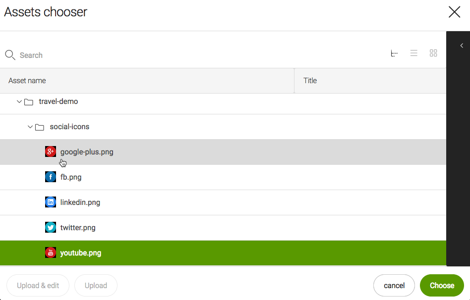
responsible for providing a view that is suitable for selecting the
item. When the target app is a content app, the
workbench
in the browser subapp is a suitable view and it is used by default. For
more complex apps like the
Assets
app - 5 UI, a
choose
dialog is configured in the app to browse the contents.
Link field properties
Simple link field definition:
form:
 tabs:
    - name: tabImage
      label: Image
      fields:
        - name: image
          fieldType: link
          targetWorkspace: dam
          appName: assets
          label: Select image
          identifierToPathConverter:
            class: info.magnolia.dam.app.assets.field.translator.AssetCompositeIdKeyTranslator
          contentPreviewDefinition:
            contentPreviewClass: info.magnolia.dam.app.ui.field.DamFilePreviewComponent
Referencing fields shortcut info - 5 UI
See Referencing fields for further information.
| Property | Description | ||
|---|---|---|---|
|
Name of field. |
||
|
required Target app name used to create the content view to choose the item from. All content apps provide a
workbench.
The workbench view is used as the link target chooser by default.
However, you can also provide a
choose
dialog and provide custom actions. See an example in
|
||
|
optional, default is `Select new…` Button label before the target node is selected. The value is i18n-able. |
||
|
optional, default is `Select another…` Button label after the target node is selected. The value is i18n-able. |
||
|
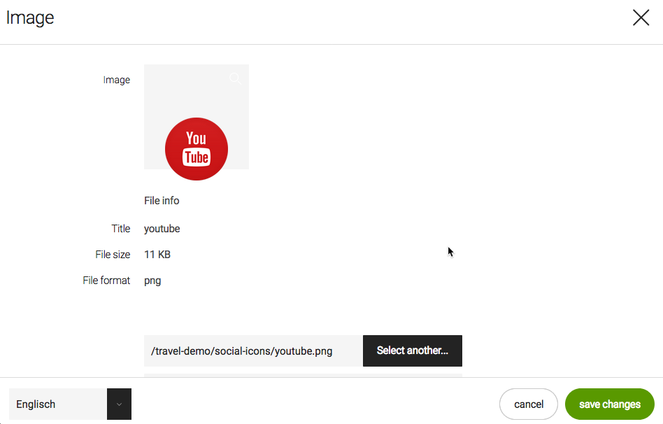
optional Render a preview of the selected content. The preview component typically displays an image thumbnail and some metadata. |
||
|
optional Any class that implements the
|
||
|
optional, default is Makes the text box displaying the link editable once a target has been selected. |
||
|
optional The link field returns the path of the selected node by default. You can convert the path to a UUID with a converter. |
||
|
optional Any class that implements the
|
||
|
optional, default is Path in the workspace that browsing is limited to. The user can start browsing at this path but they cannot navigate to nodes above or at the same level as the target path. Use this property to restrict selecting of items to a particular folder. |
||
|
optional, default is `website` Name of the workspace in which the target content is stored if the content app is JCR based. Examples: |
|appName |targetWorkspace
|pages |website
|assets |dam
|contacts |contacts
|categories |category
Common field properties - 5 UI
| Property | Description | ||
|---|---|---|---|
|
required Defines the field type via either a field alias name or a fully-qualified field definition class name. See Field definition: Field types. To check the correct form of the name, use the Definitions app. |
||
|
optional Pre-filled default value displayed in the field. The value can be overwritten by the user. Use alphanumeric characters.
|
||
|
optional Help text displayed when the user clicks the help icon. The value can be literal or retrieved from the message bundle with a key. Use alphanumeric characters in literal values. Not applicable to the static field. |
||
|
optional, default is Enables i18n
authoring support which allows editors to write foreign-language or
regionally targeted content. A two-letter language identifier (en, de,
fr etc.) is displayed on controls where |
||
|
optional, default is the message bundle defined in the dialog definition_ Message bundle such
as |
||
|
optional Field label displayed to editors. The value can be literal such as
If you do not provide the property, Magnolia will fall back to a generated i18n key and display the key in the UI. If you do not want a label at all, define the property and set its value
to a blank space such as |
||
|
optional, default is the name of the field’s parent node_ Name of the node where the value is saved. The name |
||
|
|||
|
optional, default is Makes the field uneditable. Adding this property has the same effect as creating a static field. |
||
|
optional, default is Makes the field required (mandatory). An asterisk is displayed next to the field label. See also Checking for null values. |
||
|
optional, default is Error message displayed when required is true and the user saves an
empty field. The value can be literal or retrieved from the
message bundle with
a key such as |
||
|
optional Adds one or more style names to this component. Multiple styles can be
specified as a space-separated list of style names such as
|
||
|
optional Property transformer classes define how field values are stored in the repository. Each field has a default transformer class. You don’t need to define a class unless you want to override the default. The value is a fully-qualified class name.
|
||
|
optional, most fields set a default value automatically JCR property type of the stored value such as |
Using link fields with JCR-agnostic target apps
The link field also allows you to choose items from non-JCR apps.
To understand the process when choosing an item from a content app
via a link field, basic knowledge of the
Content
app framework and LinkField is necessary.
Things to note about LinkField:
-
It extends a custom Vaadin field,
-
It stores a value which must be String.
-
It has a callback (
ChooseDialogCallback). -
When choosing an item, the method
#onItemChosen(actionName, chosenValue)is triggered on the callback. The parameter choosenValue is of typeObjectand is the corresponding ItemId of the item of the content app (see ItemIds and Items).
Depending on the implementation of the content app, ItemId may be a
String or a more complex Object. A well-known ItemId is JcrItemId.
The callback properly handles JcrItemId, and if it is another type,
String.valueOf(chosenValue) is saved to the link field.
When using LinkField with JCR-agnostic target apps that use complex
ItemIds that extend Object, override the public String toString()
method on the implementation of the itemId.
If LinkField does not work for your custom content app, create a custom link field. See Custom fields for more.