Rich text field
The rich text field (RichTextFieldDefinition) is powered by CKEditor 4.
It is a custom Magnolia field.
The field properties allow you to configure some CKEditor features in the rich text field.
In addition to the YAML field property configuration options described on this page, you can customize the CKEditor to obtain the full range of features with JavaScript configuration files. For more information, go to the CKEditor customization page.
|
This rich text field definition is part of the Magnolia 6 UI
framework. The fully qualified class name is
If you work with the Magnolia 5 UI framework, see Rich text field for Magnolia 5 UI instead. |
Rich text vs light rich text field
Alternatively, if you’re considering using a Rich text field as part of a blog post template, consider using a Light rich text field. The Light rich text field is a special type of rich text field provided by the Content Editor module. Compared to the rich text field, the light rich text field has limited formatting functions. In addition, the field can only be used as a content block in a custom content editor.
Configuration
Example definition
richText:
  $type: richTextField
  label: Text editor
  height: 300
  tables: true
source: true|
You can preview this example in the |
Field properties
Field-specific properties
| Property | Description |
|---|---|
|
optional, default is Allows text alignment for paragraphs. When |
|
optional Colors displayed in the color selector. Comma-separated hexadecimal
color codes without the |
|
|
|
optional List of font names displayed in the font selector. Separate entries with a semi-colon
(for example, |
|
optional List of fonts sizes displayed in the font selector. Separate entries
with a semi-colon (for example, |
|
optional, default is Height of the field (including the toolbar). This property accepts an
integer (to denote a value in pixels). Value of |
|
optional, default is Allows images from the DAM. When |
|
optional, default is Allows bulleted and numbered lists. When |
|
optional, default is Allows toggling between text and HTML editing. When |
|
optional, default is Allows tables. When |
|
optional List of JCR or DAM link field definitions. It can be used to provide custom chooser dialogs. Example configuration
|
Common simple field properties
| Property | Description | ||||
|---|---|---|---|---|---|
|
required Name of the field definition item. Derived from the configured node name. Use alphanumeric characters without spaces. |
||||
|
required (unless Type of the field definition item. The value must be a fully qualified
class name and a subtype of |
||||
|
You can use this as a shortcut for Example class annotation
See Field types for possible values. |
||||
|
optional Property type of the field.
|
||||
|
optional Converts values between the presentation (UI) and model (stored data). The property must extend
|
||||
|
optional, default is translated Message shown when there is an error in the conversion process. The value can be literal or a key of a message bundle. |
||||
|
optional Pre-filled default value displayed in the field. The value can be overwritten by the user. Use alphanumeric characters.
|
||||
|
optional Help text displayed when the user clicks the help icon. The value can be literal or a key of a message bundle. |
||||
|
optional Defines the factory class that initializes and builds the Vaadin form field. The default factory class depends on the particular field. The value must be a fully qualified class name and a subtype of
|
||||
|
optional Defines the binder class that applies configuration parameters from the field. |
||||
|
optional, default is Enables i18n
authoring support, which allows editors to write foreign-language or
regionally targeted content. A two-letter language identifier ( |
||||
|
optional Field label displayed to editors. The value can be literal or a key of a message bundle. If you do not provide the property, Magnolia will fall back to a generated i18n key. If you do not want to have any label, set the property to an empty
string such as |
||||
|
optional, default is Makes the field uneditable. |
||||
|
optional, default is Makes the field required. When
|
||||
|
optional, default is translated Error message shown when |
||||
|
optional Additional style information for an editor property definition item applied to the element when the form is rendered. The value can be a CSS class or a list of CSS classes separated by white spaces. The style name will be rendered as an HTML class name, which can be used in a CSS definition.
The class name is added to the field by calling the Vaadin method
|
||||
|
optional List of field validator definition items. Any value must be a subtype of
See Field validators for more information. |
More example definitions
The first way to change the rich text field is by adding YAML field properties. The example at the top of the page is extended below to include colors, fonts, and font sizes in the CKEditor dialog toolbar.
form:
  properties:
    richText:
      $type: richTextField
      label: Magnolia richTextField
      height: 300
      tables: true
      source: true
      colors: 00923E,F8C100,28166F
      fonts: Arial/Arial,sans-serif;Times New Roman/Times New Roman,serif;Verdana
      fontSizes: 16/16px;24/24px;48/48px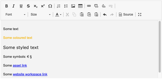
Decode CKEdtior output text
If the content from a rich text field is not decoded, you can see the HTML tags when previewing the page in Magnolia. When the content is decoded in the respective FTL file, the content is displayed without the HTML elements.
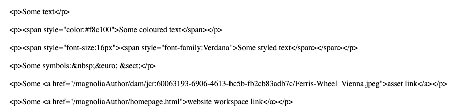
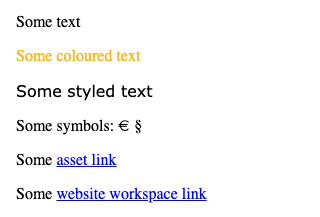
CKEditor produces HTML such as <p> elements for paragraphs.
However, text stored in JCR usually escapes HTML code.
To render text that originates from a rich text field, you need to decode the stored content to make sure the HTML tags are rendered properly again.
Here is how to decode the content object in your FTL file and get the desired property from it:
${cmsfn.decode(content).text!""}See cmsfn: Decode HTML for more information.
Customization
Customizing rich text fields beyond its YAML definition is done with JavaScript files in CKEditor 4. Go to CKEditor customization for default JavaScript configurations and further details about customizing CKEditor 4.