Parts of a content app - 5 UI
Deprecated
|
This content app framework has been deprecated since Magnolia 6.0. It is part of the Magnolia 5 UI framework. |
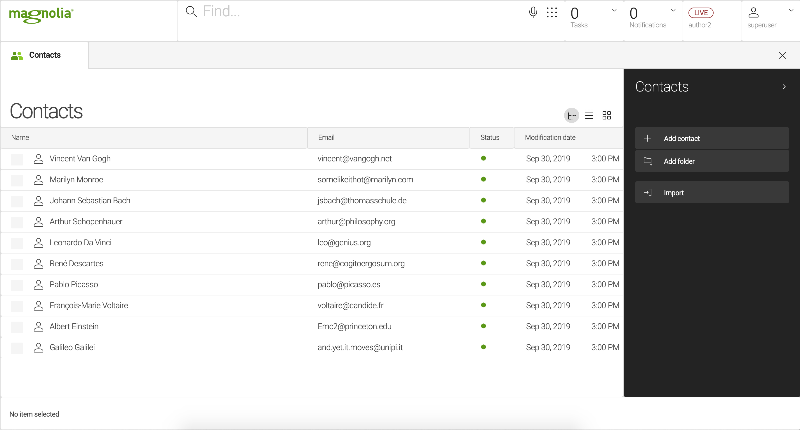
The content app user interface consists of subapps, a workbench and an action bar. These reusable parts let you build content apps quickly.
Content app
A Content app is a specialized app type for managing structured content. The content app user interface consists of a browser subapp and one or more detail subapps. Content apps make it easy to enter items such as products or events. Many native Magnolia apps such as Tours and Contacts are content apps. Because this app style is used often, the framework provides convenience classes to make building a content app faster.
Subapps
A content app always has at least two subapps: browser and detail. A subapp is typically displayed to users as a tab.
Workbench
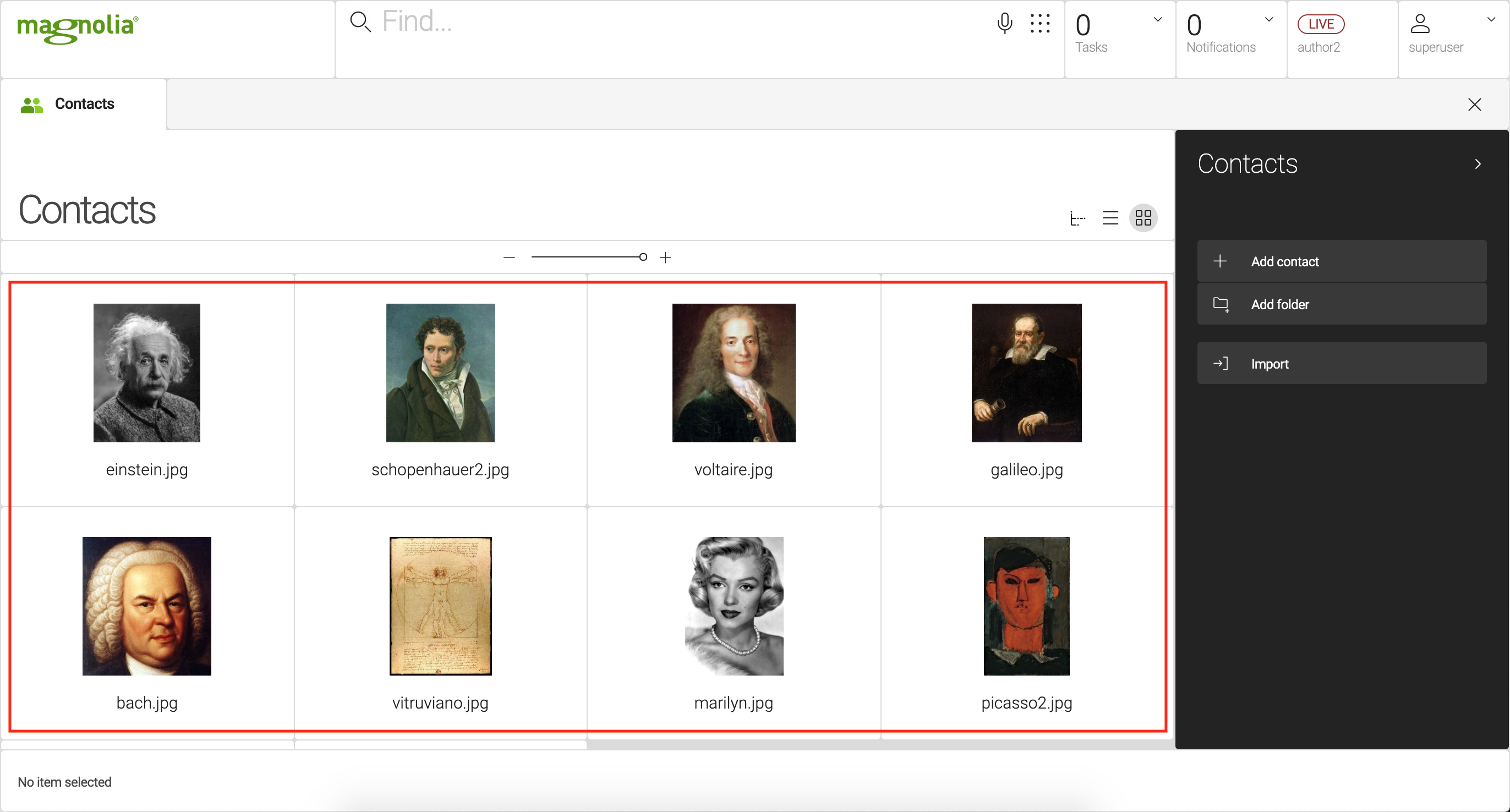
Workbench is a view that displays content items in a workspace. It is part of the content app framework, typically defined in the browser subapp. The workbench contains a list of content views. Common view types are tree, list and thumbnail.
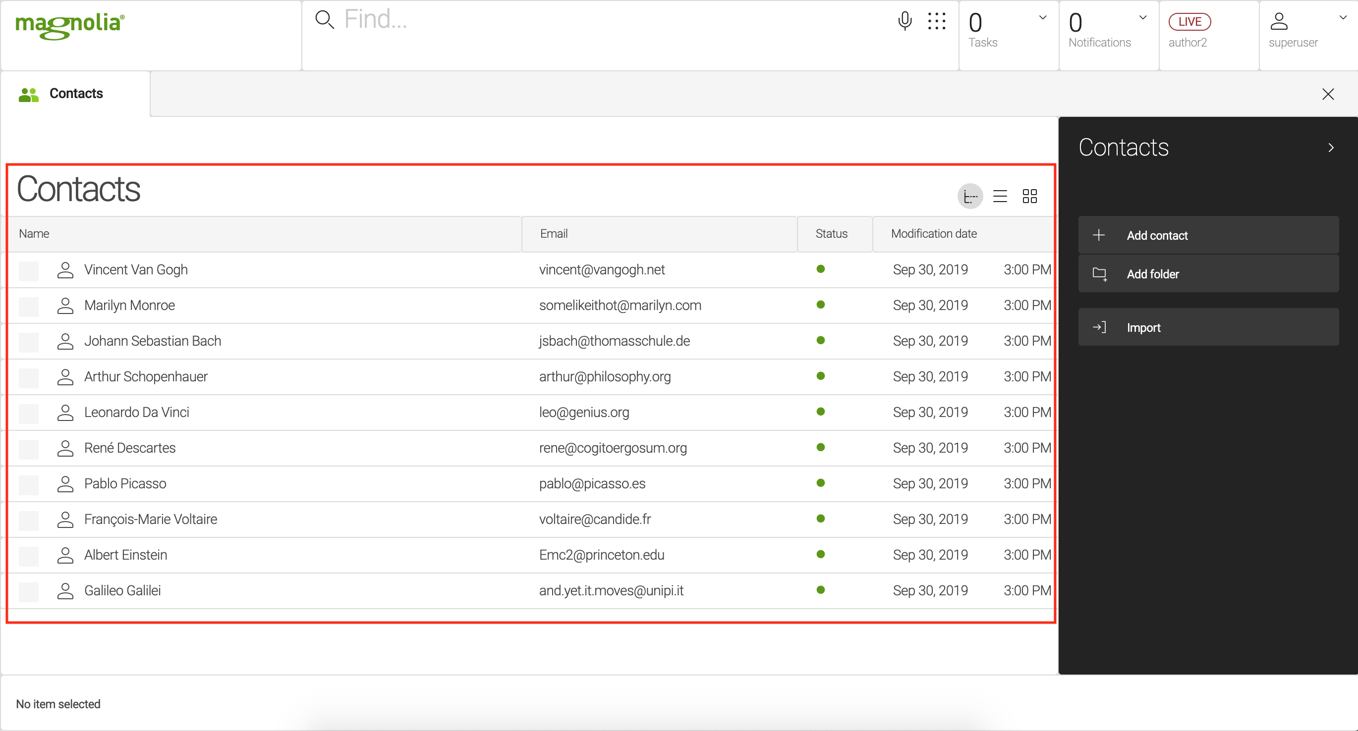
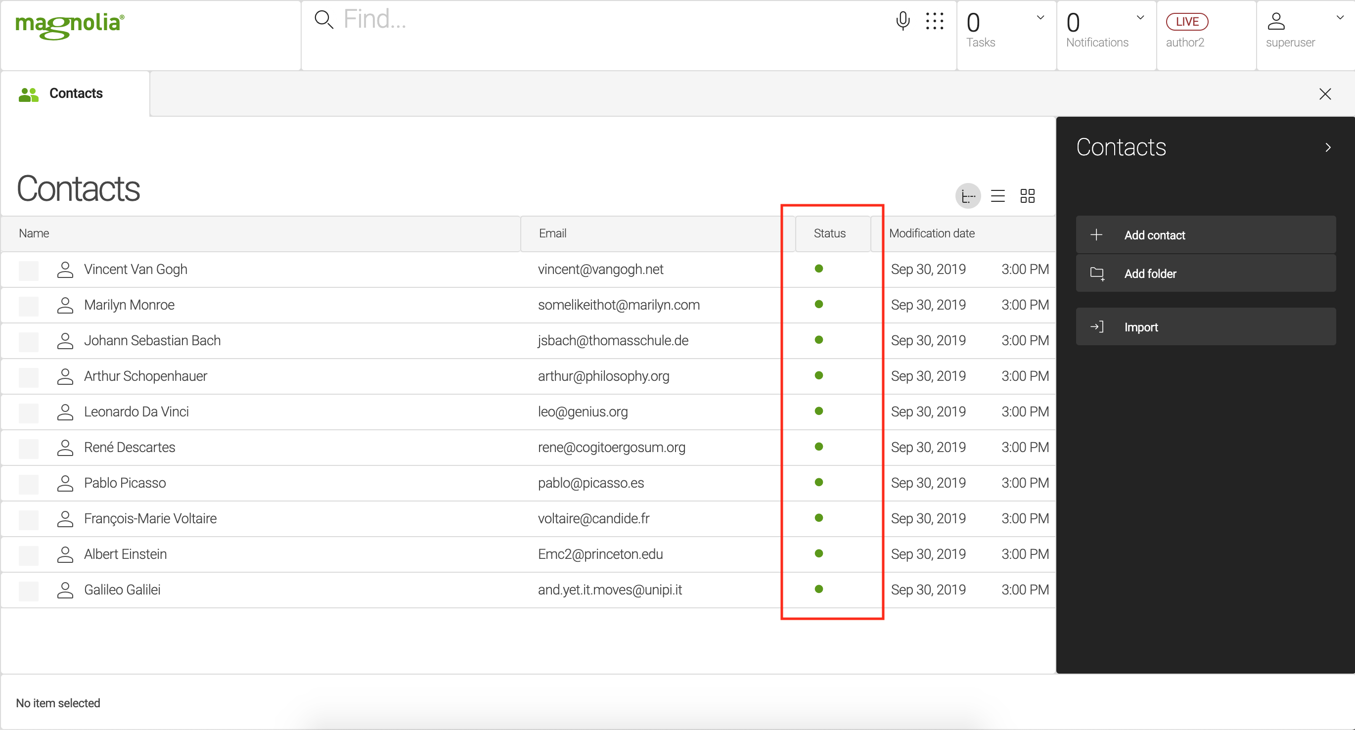
Publication Status
The content app displays the publication status in the status columns of the workbench:
Here we talk about status for content. Content that is created by content editors. This should not be confused with configuration status since configuration is installed.
- Publication status
-
-
 Published
(solid green circle): Content was published from the author instance to the
public instance. Identical content exists on both instances.
Published
(solid green circle): Content was published from the author instance to the
public instance. Identical content exists on both instances. -
 Modified
(amber circle with a dot): Content was modified since publication. The
author instance is not in sync with the public.
Modified
(amber circle with a dot): Content was modified since publication. The
author instance is not in sync with the public. -
 Unpublished (red circle): Content exists only on the author instance.
-
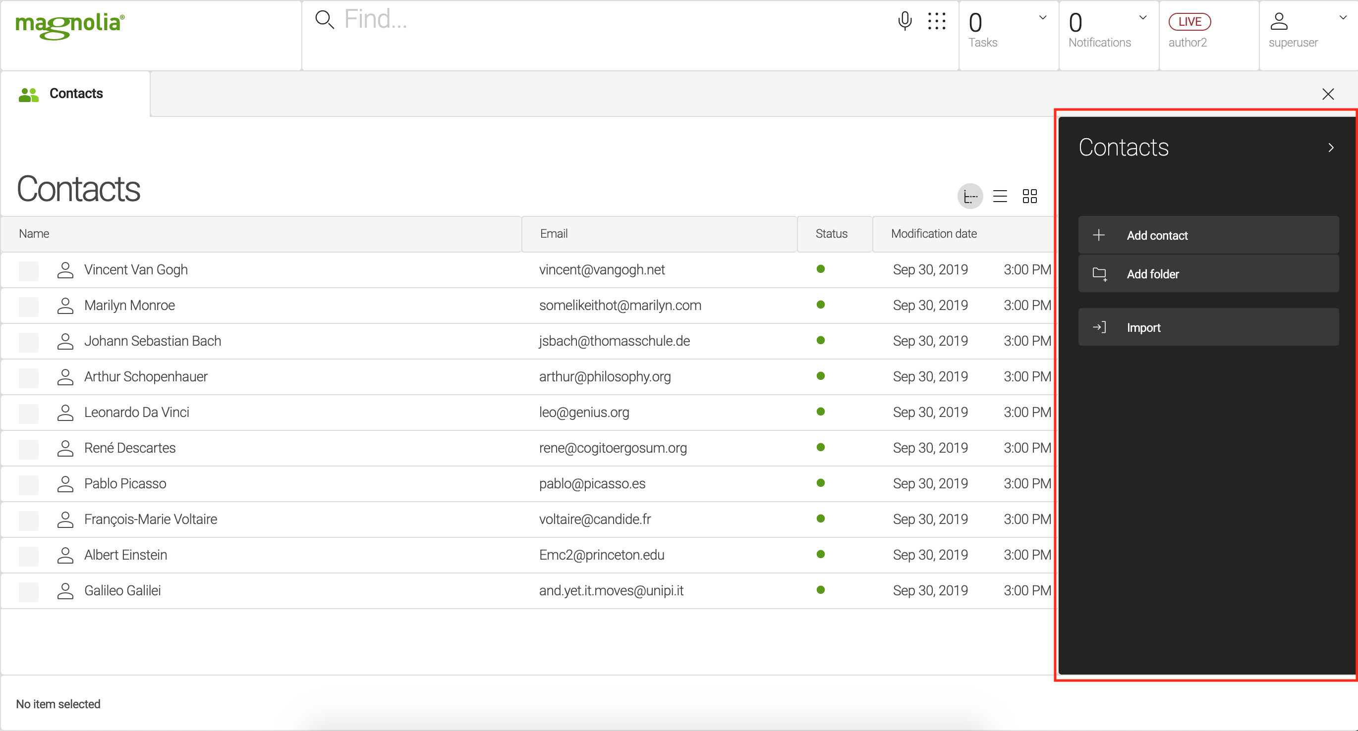
Action bar
An action bar makes actions available to users. The action bar is typically displayed on the right-hand side of the browser subapp. The action bar definition organizes actions into sections (green label) and groups (between horizontal lines). Availability rules determine which section is displayed to the user. For example, when the user selects a content item in the browser subapp, availability rules display only actions that are relevant to working with that item. A group contains actions that have something in common, such as actions for adding things.
Action popup
Action popup is a context menu that is displayed when the user right-clicks an item. You should only display often used actions in the popup so that it remains usable. If your app only has a few actions, you may want to simply extend the action bar. This way the popup displays the same actions as the action bar. Extending also allows you to manage the items in one place rather than two.
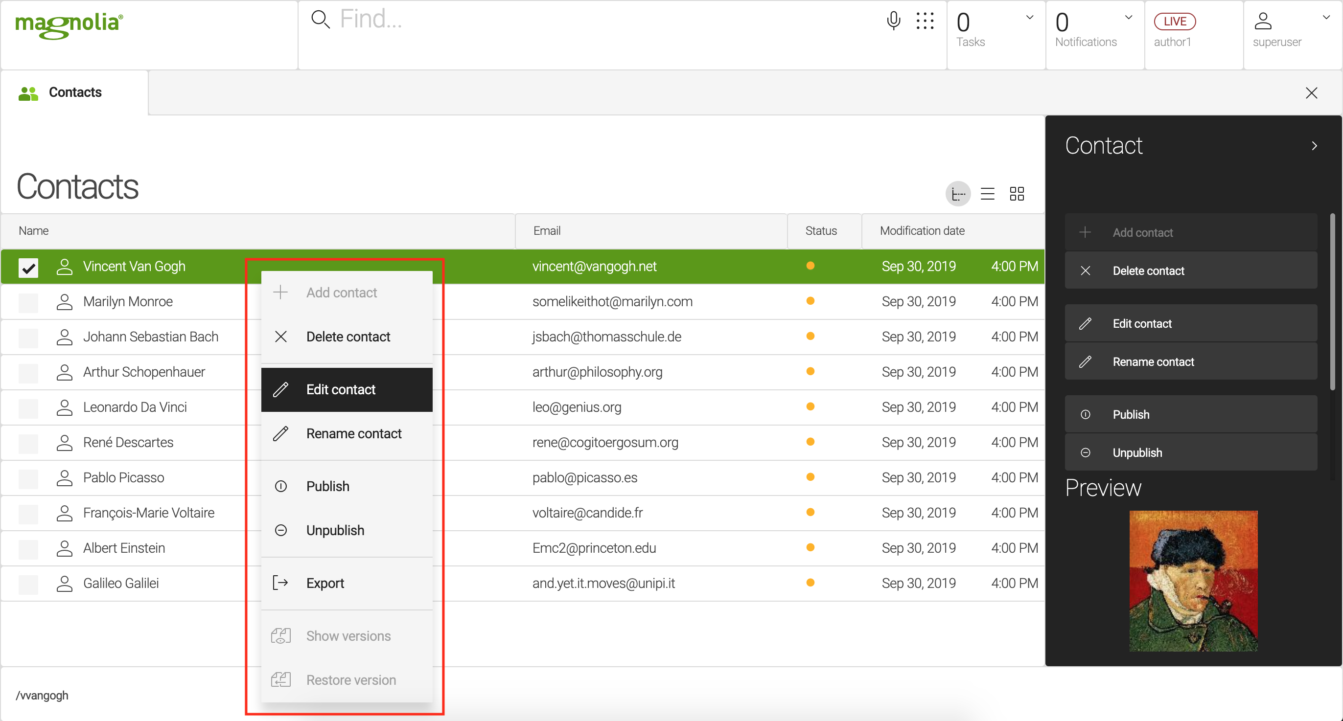
What is an image provider
Image provider is a component that renders images used in apps. It generates the portrait image at the bottom of the action bar and the thumbnails for the thumbnail view.
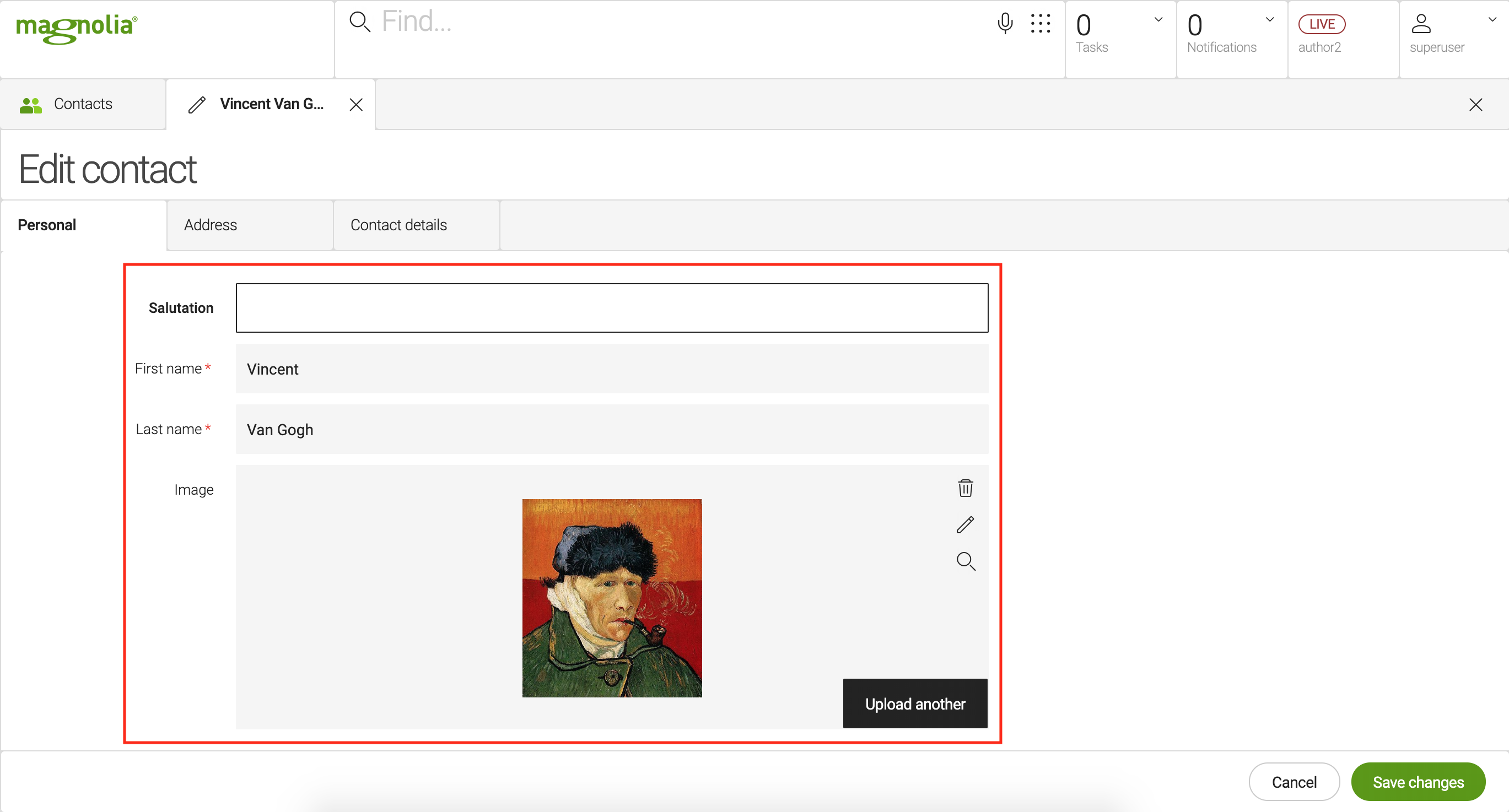
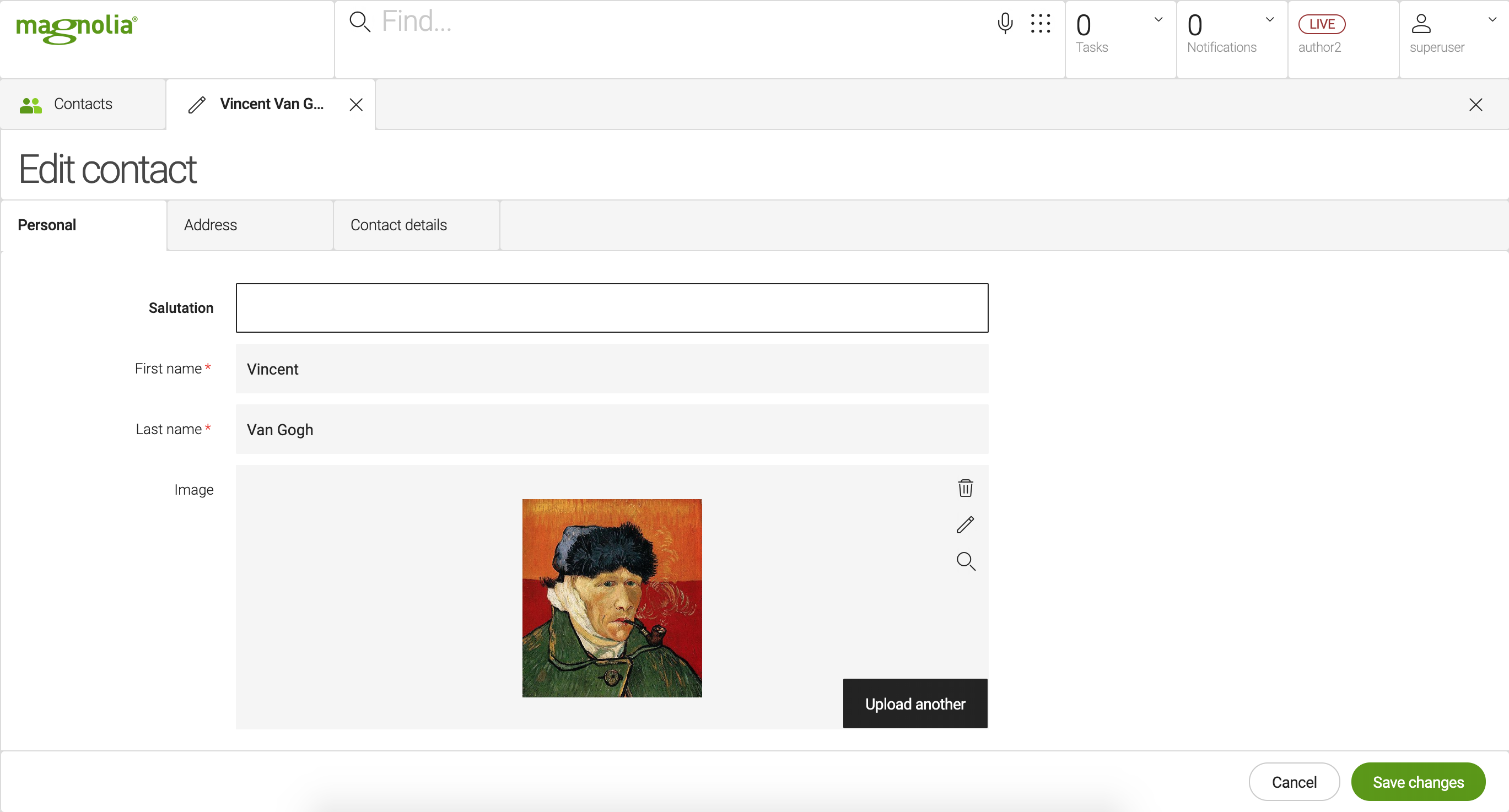
What is an editor
Editor is a component that edits a content item. The editor typically
contains a form. In a content app, you should create an
editor
definition under the detail subapp. Define the node types the editor
edits, a form for editing them, and actions for saving the edit.