Dialog types
|
These dialog types are part of the Magnolia 6 UI framework. If you work with the Magnolia 5 UI framework, see Dialog types for Magnolia 5 UI instead. |
Simple dialog
Use a simple dialog to collect only few data points. A simple dialog provides limited ways to organize and group fields.
Characteristics:
-
No tab bar (the dialog is composed of one tab).
-
One or more fields.
Complex dialog
Use a complex dialog to collect larger amounts of data. A complex dialog can handle complex, hierarchical data sets and summarize key settings of some or all of its subforms.
Characteristics:
-
Multiple tabs for grouping fields.
-
One or more fields per tab.
Light dialog
Use a light dialog as part of the task the user is working on. A light dialog asks for quick input but does not severely interrupt the user.
Characteristics:
-
Commonly used with actions that require parameters from the user.
-
Only makes sense in the context where the user is working.
-
Displayed modally but does not black out the background.
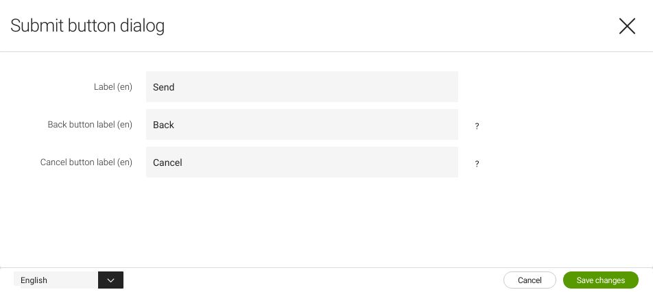
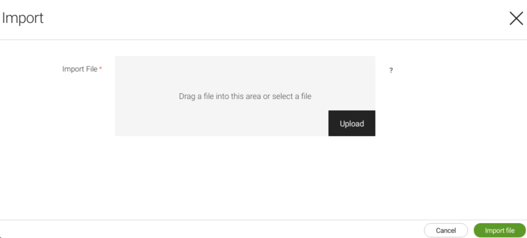
Strong dialog
Use a strong dialog to collect data from the user. A strong dialog severely interrupts the user because it typically requires more data to be input.
Characteristics:
-
Commonly used with more elaborate actions (such as uploading a file).
-
Displayed modally and blacks out the background.
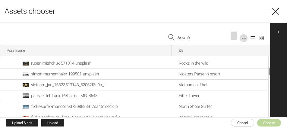
Chooser dialog
Use a chooser dialog to select an item from any data source (for example, an asset to render an image or a page to tease). You can configure a workbench with columns of your choice. Column filters are used to search in a chooser dialog.
To learn about the dialog properties, see info.magnolia.ui.chooser.definition.ChooserDefinition.