Message types
You can show information to users in three basic types: Notifications, alerts and pop-ups.
Message style types
All message types have at least the following levels of urgency, as defined in info.magnolia.ui.api.message.MessageType:
-
ERRORmessages report a severe problem that has occurred. -
WARNINGmessages warn the user that the system has detected a condition which requires the user’s attention. -
INFOmessages simply inform the user about a change or a situation. -
WORKITEMis a special type reserved for workflow messages.
Notification
Notifications are banner-type messages that inform the user about system and app events. Notifications are displayed prominently at the top of the Magnolia UI. They capture the user’s attention effectively but do not interrupt what the user is currently working on. Notifications are the only persistent message type. The user can safely close the notification banner and read the full message in the Notifications app later.
Behavior
-
Notifications must be closed by the user. A notification stays on the page until the user clicks it.
-
Not displayed modally. Does not interrupt what the user is currently working on.
-
Persistent. The message is stored in the
messagesworkspace. -
Only the title and an optional short description is displayed in the notification. Full message is in the Notifications app.
-
Clicking the Read more button on the notification opens the message in the Notifications app.
-
Notification messages can be displayed to the current user, a specific named user, a group of users, or broadcast to all users.
Examples
-
An error captures an exception that occurred in an app and which was not foreseen. (
ERRORmessage sent by an app) -
A warning is sent since the license of a particular app is about to expire. (
WARNINGmessage sent by an app) -
A warning is sent to an administrator that the license of a particular Magnolia instance is about to expire. (
WARNINGmessage sent by the system) -
An administrator is informed that a new version of a particular app is available. (
INFOmessage sent by an app) -
An administrator sends an instance-wide message to all users that the instance will be taken down and restarted in an hour. (
INFOmessage defined by and sent to all users by an admin app)


Alert
Alerts are modal messages that show up in the context the user is currently working in. You can use alerts to confirm that an action should be executed, inform the user of harmful consequences, or report the progress of a long-running action. Since alerts are modal they block the user interface.
| Do not use alerts to gather any user input. For quick input, use a light dialog instead. Light dialogs are meant to carry a small set of form fields and still resemble regular dialogs. For complex input, use a regular dialog. Dialogs should be used when presenting the forms for adjusting the page properties or the settings in the user profile. You might even want to use a wizard dialog, if you have to guide your user through multiple steps. |
Behavior
-
Alerts are displayed in the context the user currently works in. They don’t make much sense outside of context.
-
Transient. Alerts are not stored and thus they do not show up in the Notifications app.
-
Sent by apps, subapps or shell apps. Alerts often originate from a particular UI element within an app.
-
Modal. Alerts block the UI element they originate from.
-
Personal. Displayed only to the user who triggers the alert. Alerts cannot be sent to other users.
-
Don’t collect user input with alerts. Simple button answers only: Yes/No, OK/Cancel.
When to use
-
Yes-No question: an alert asks the user whether an action should proceed or not.
-
Confirmation: an alert informs the user of an important fact and requires that the user confirm it was read and understood.
-
Cancel confirmation: an alert confirms that an action was successfully aborted by the user and informs about the consequences.
-
Progress report: an alert reports the progress of a long-running action that needs to block the UI - or at least major parts of it.
Examples
-
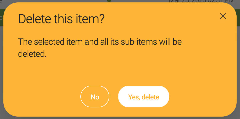
A user deletes one or more contacts. An alert asks the user to confirm the deletion because it cannot be undone. (Yes-No question)
-
A user aborts a simultaneous publication of several pages. An alert confirms that the action was canceled and lists pages that were already published as well as those that were not. (Cancel confirmation)
-
An alert asks the user to confirm a publication request. The same message allows the user to also publish all subitems as well by checking a box. (simple form + Yes-No question)
How to show
See Showing alerts
Pop-up
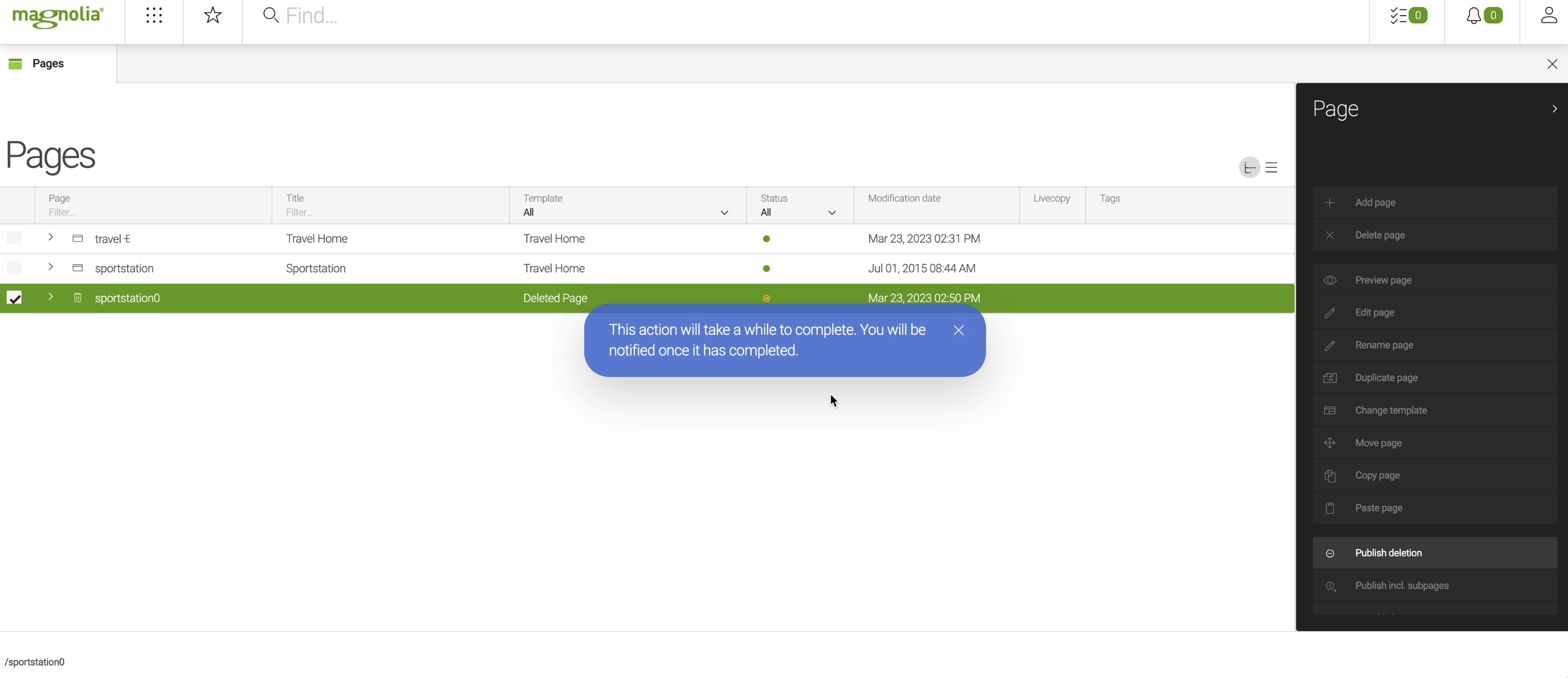
Pop-ups are non-intrusive messages that inform the user whether an action was completed or aborted successfully. Typically they confirm something. Pop-ups look like Post-IT notes. They go away automatically and don’t require user action. Use pop-ups to confirm what the user did and provide them with confidence and assurance.
Behavior
-
Inform that an action was or currently is being executed. Pop-ups may also inform that an action failed to properly perform its task.
-
Displayed in the context the user currently works in. They don’t make much sense outside of context.
-
Transient. Pop-ups are not stored and thus they do not show up in the Notifications app.
-
Sent by apps, subapps or shell apps.
-
Non-modal. pop-ups don’t block the UI and they go away automatically after 3 seconds.
-
Personal. Displayed only to the user who triggers the pop-up. Pop-ups cannot be sent to other users.
-
Don’t collect user input with pop-ups. Just inform the user of changes.
When to use
-
Success confirmation: a pop-up confirms that an action was executed successfully.
-
Cancel confirmation: a pop-up confirms that an action was successfully aborted by a user.
-
Progress report: a pop-up reports the progress of a long-running, non-blocking action.
-
Quick info: a pop-up reports that an event has occurred that affects what the user is currently working on.
Examples
-
A user publishes many pages at once. A pop-up reports on how far the publication has proceeded and how long it still takes to complete. (Progress report)
-
At the end of a long publication process, a pop-up confirms that all 20 pages were published successfully. (Success confirmation)
-
During an image upload, a pop-up signals the upload progress using a progress bar. (Progress report)
-
A user aborts an image upload. A pop-up confirms that the upload was canceled. (Cancel confirmation)
-
Another user has just started to edit the same item as you. A pop-up tells you are now working on the same content. (Quick info)
How to show
See Showing pop-ups