Form module
Content management Bundled: Community Edition
| Edition | CE |
|---|---|
License |
|
Issues |
|
Maven site |
|
Latest |
2.7.8 |
No |
The Form module allows you to create Web forms that visitors can fill in. The module provides components for easy creation of standard forms, like contact forms. You can group related form elements such as address fields together visually. Form data can be validated using configurable validators. By default, submitted form data is sent by email. You can process form data with pluggable data processors which allow customization without changing the Magnolia core system. Magnolia forms are fully HTML5 compliant.
|
Please note that the artifact IDs (Maven If you have custom Java code relying on this module, you need to install a compatibility module too. |
Installing with Maven
Bundled modules are automatically installed for you.
If the module is unbundled, add the following to your bundle including your project’s <dependencyManagement> section and your webapp’s <dependencies> section.
If the module is unbundled but the parent POM manages the version, add the following to your webapp’s <dependencies> section.
<dependency>
  <groupId>info.magnolia.form</groupId>
  <artifactId>magnolia-form</artifactId>
  <version>2.7.8</version> (1)
</dependency>| 1 | Should you need to specify the module version, do it using <version>. |
|
Note the changes in |
Compatibility module
We have been gradually removing the old Content API from our modules since Magnolia 5.6. If you have custom code relying on classes from the old Form module, you must do one of two things:
-
Update your code for the new version of the Form module.
-
Use the
magnolia-form-compatibilitymodule together with themagnolia-core-compatibilitymodule.
Add the following snippet to your POM file:
<dependency>
  <groupId>info.magnolia.form</groupId>
  <artifactId>magnolia-form-compatibility</artifactId>
  <version>2.7.8</version> (1)
</dependency>| 1 | Should you need to specify the module version, do it using <version>. |
Mail configuration
The Form module uses the Mail module to send form data in emails. See Configuring SMTP to enable mail sending.
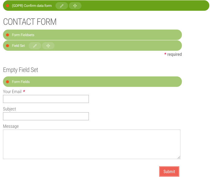
Creating a form
|
See an example form on the Contact page of the Travel Demo. The Travel Demo uses several GDPR-ready form components. The (GDPR) Store data form in the Travel Demo is equivalent to the form component below. |
To create a form:
-
Add a form component to any area of a new or existing template.
Example: Adding theformcomponent to themainarea of a new template./my-module/templates/pages/form.yamltemplateScript: /my-module/templates/pages/form-page-template.ftl renderType: freemarker visible: true title: Form Template dialog: my-module:pages/form areas: main: availableComponents: form: id: form:components/form -
Create a new page based on the template that contains the form component (created above).
-
Open the page, add the form component and configure the form settings. Form settings define the title and name of the form and where the collected information should be submitted.
-
Add a field set to the form.
You can have multiple field sets in one form. This helps group them visually (for example, contact details in one set and feedback messages in another).
-
Add fields inside the field set.
-
View the form.
Creating forms for handling personal data
With Magnolia, you can create forms for the purpose of handling personal data such as for the requirements of General Data Protection Regulation (GDPR).
Magnolia provides the following pre-configured GDPR-related form templates as samples you can build on:
| Sample form | Used to create | Provided by | ||
|---|---|---|---|---|
Store data form, Confirm data form |
Double opt-in forms.
|
|
||
Get visitor data form |
Forms where the user can request a zipped report listing their personal data stored by the site. |
|
||
Forget me form |
Forms where the user can request deletion of their personal data. |
|
||
Delete visitor form |
Forms where the user can confirm a request for deletion of the user’s personal data |
|
Personal data form processors
To implement the above functions, the magnolia-privacy module provides
the following form processors:
-
info.magnolia.privacy.form.processor.AddConsentFormProcessor: Updates a visitor’s consent.
-
info.magnolia.privacy.form.processor.JcrStoreFormProcessor: Extends the functionality of the AddConsentFormProcessor processor. It also stores the data into a JCR workspace. The data is stored in an intermediate workspace so that the data cannot be used unless the visitor confirms consent. Under the processor define:
-
workspace- the name of the intermediate workspace. -
nodeNameProperty- the node name of the data to be stored. -
nodeType- the node type of the data to be stored. -
rootPath- the path to the node (default is/).
-
-
info.magnolia.privacy.form.processor.JcrMoveFormProcessor: Moves data from the intermediate workspace to the target workspace. Configure the intermediate and target workspaces under the processor using the
sourceWorkspaceandtargetWorkspaceproperties.
-
-
info.magnolia.privacy.form.processor.ConfirmConsentFormProcessor: Confirms a visitor’s consent.
-
info.magnolia.privacy.form.processor.GetVisitorDataFormProcessor: Collects all data belonging to a visitor and provides a weblink where the visitor can download this data.
-
DeleteVisitorFormProcessor: Requests the deletion of all a visitor’s data (via adeletionId). -
info.magnolia.privacy.form.processor.ConfirmVisitorDeletionFormProcessor: Confirms the deletion request.
See GDPR and forms too.
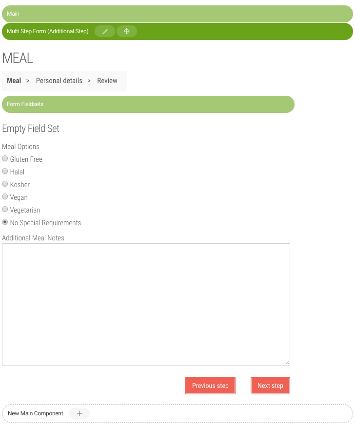
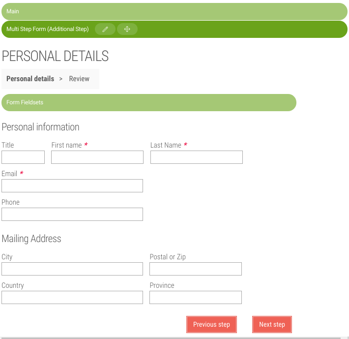
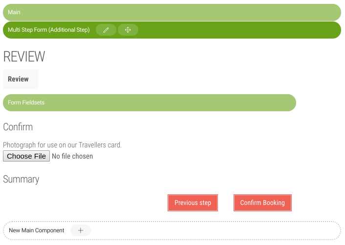
Creating a multistep form
| See an example multistep form on the Book your tour page of the Travel Demo. |
Splitting a large form into multiple steps allows the visitor to focus on one step at a time. The substeps are detected automatically. Visitors can move forward and backwards between steps without losing entered data. Each step is validated individually. The form module also allows users to upload files, but the upload field should only be included as the last step of the process.
-
Add a form step component to an area of a template.
Example: Adding theformStepcomponent to themainarea in a new template./my-module/templates/pages/form.yamltemplateScript: /my-module/templates/pages/formStep-page-template.ftl renderType: freemarker visible: true title: Form Step Template dialog: my-module:pages/form areas: main: availableComponents: form: id: form:components/formStep -
Create a new page based on a template that contains the form component. This is the first page of the form.
-
Configure the form settings.
-
Add a field set component
-
Add fields inside the field set. The Submit button field will automatically navigate to the next step. Conditional steps can be set in the next step condition component.
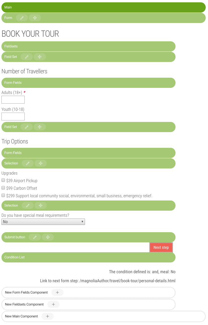
-
-
Create subpages based on the template that contains the form step component (created above) for the subsequent steps of the form.
-
Add field sets and fields to the substep forms. The Submit button field will automatically navigate to subsequent or conditional steps, and the final button will submit the form.
-
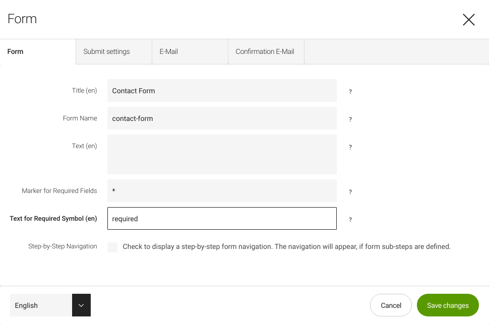
Configuring form settings
Form settings are configured in the form component.
Form tab
| Field | Description |
|---|---|
Title |
Title displayed above the form. For example, |
Form name |
Internal name that allows you to reference the form by name, for example from JavaScript. |
Text |
Introductory text displayed below the form title. |
Marker for required fields |
Character displayed next to required fields. Asterisk by default. |
Text for required symbol |
Text that explains what the required marker
means, displayed near the top of the form. For example, |
Step-by-step navigation |
When checked displays step-by-step breadcrumb navigation that allows the user to navigate the steps of multistep forms. |
Submit settings tab
| Field | Description | ||
|---|---|---|---|
Error title |
Title displayed when an error occurs. For example, |
||
Success title |
Title displayed when the form is submitted successfully.
For example, |
||
Text |
Text displayed when the form is submitted successfully. For example,
|
||
Page displayed after submission |
Select a page to display after submission. If no page is selected, the user stays on the current page and the success title and text are displayed instead. |
||
Track mail |
Logs the information submitted in the form to the
|
Email tab
| Field | Description |
|---|---|
From |
Email address displayed in the From field of the outgoing message. This can be any address as it is not the account used to send the mail. The mail is sent using the account in SMTP configuration. |
To |
Email address the data is sent to. You can use form field names
with Freemarker tags. Typically you would ask the submitting user for
their email address on the form and repeat it here with a Freemarker tag
such as |
Subject |
Email subject line. You can use form field names with
Freemarker tags such as |
Available fields for Freemarker syntax |
Form field names that can be used in Freemarker tags. |
Type |
Radio button to select the message type for the email body. |
text |
Displays a
text
field to compose the email template. You can use form field names with
Freemarker tags such as |
html |
Displays a rich text field to compose the email template. You can use markup that will be escaped. |
Confirmation email tab
| Field | Description | ||
|---|---|---|---|
Send confirmation |
Sends a confirmation mail to the submitting user.
|
||
From |
Email address displayed in the From field of the outgoing message. You might want to use a customer support address here in case the user has further questions or a no-reply address. You can use form field names with Freemarker tags. |
||
To |
Email address the data is sent to. You can use form field names
with Freemarker tags such as |
||
Subject |
Email subject line, for example |
||
Available fields for Freemarker syntax |
Form field names that can be used in Freemarker tags. |
||
Mail type |
Radio button to select the message type. For code and text
you can use form field names with Freemarker tags such as |
||
Type: code |
Displays a code field (includes syntax highlighting) to compose the email template. |
||
Type: text |
Displays a text field to compose the email template. |
||
Type: page |
This option means that the content of a page is sent to the user. The internal process reads the page content, pastes the content in the body of the email, and sends the mail to the user. The page itself, however, does not need to be available to the visitor. |
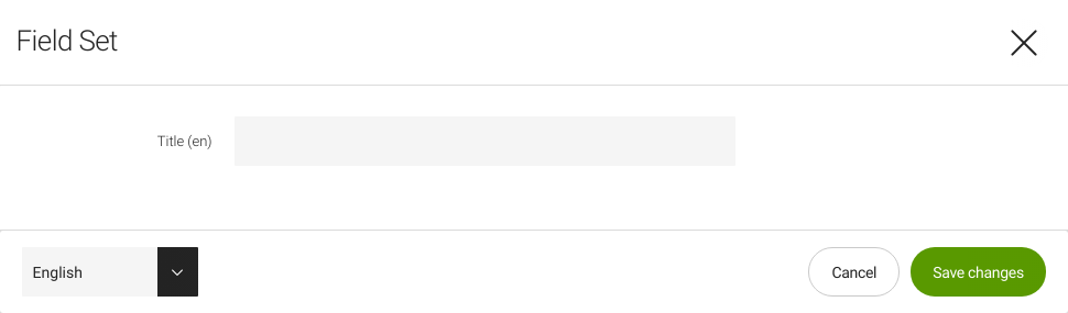
Field sets
The purpose of a field set is to group fields that logically belong together:
-
Before you can add any fields to the form, you need to add at least one field set component.
-
You can add as many field sets as necessary.
-
Use the Title field to distinguish field sets or include introductory text.
-
Individual field components are added as subcomponents in a field set.
-
Component definition:
formGroupFields
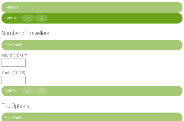
Fields
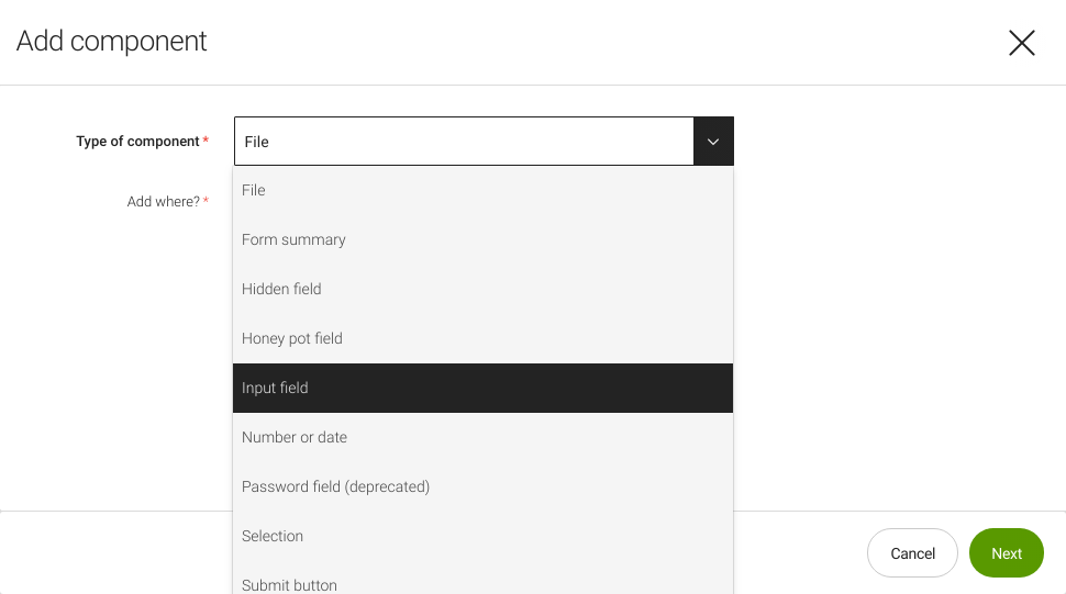
Field components are added within a field set.
Available fields:
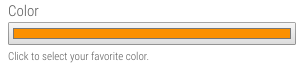
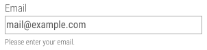
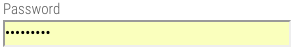
| Field | Description | ||||||||||||||||||||||||||||||||||||||||||||||||||||||||
|---|---|---|---|---|---|---|---|---|---|---|---|---|---|---|---|---|---|---|---|---|---|---|---|---|---|---|---|---|---|---|---|---|---|---|---|---|---|---|---|---|---|---|---|---|---|---|---|---|---|---|---|---|---|---|---|---|---|
Input |
Advanced options: Not all input types and attributes are supported in all browsers.
|
||||||||||||||||||||||||||||||||||||||||||||||||||||||||
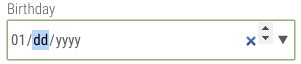
Number or date |
Advanced options: Not all input types and attributes are supported in all browsers.
|
||||||||||||||||||||||||||||||||||||||||||||||||||||||||
Text field group |
|
||||||||||||||||||||||||||||||||||||||||||||||||||||||||
Selection |
|
||||||||||||||||||||||||||||||||||||||||||||||||||||||||
File |
|
||||||||||||||||||||||||||||||||||||||||||||||||||||||||
Submit button |
|
||||||||||||||||||||||||||||||||||||||||||||||||||||||||
Hidden |
|
||||||||||||||||||||||||||||||||||||||||||||||||||||||||
Honeypot |
|
||||||||||||||||||||||||||||||||||||||||||||||||||||||||
Form summary |
|

|
Users are allowed to enter HTML-like characters such as |
Conditional steps
The condition list component provides optional, additional business logic to a multistep form.
-
The component is added automatically after the Submit button field as an optional area.
-
It allows you to set conditions for subsequent steps in a multistep form.
-
It lets you define the page the user is directed to based on what they previously entered.
Field validators
Validators are used to ensure that form data is entered in the correct
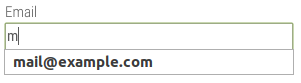
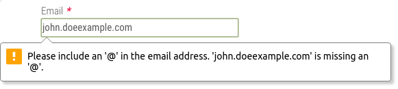
format. For example, an email address should follow established syntax
where a local part is followed by the @ character and a domain
(john.doe@example.com).
Choose a validator for appropriate fields in the Validation field.
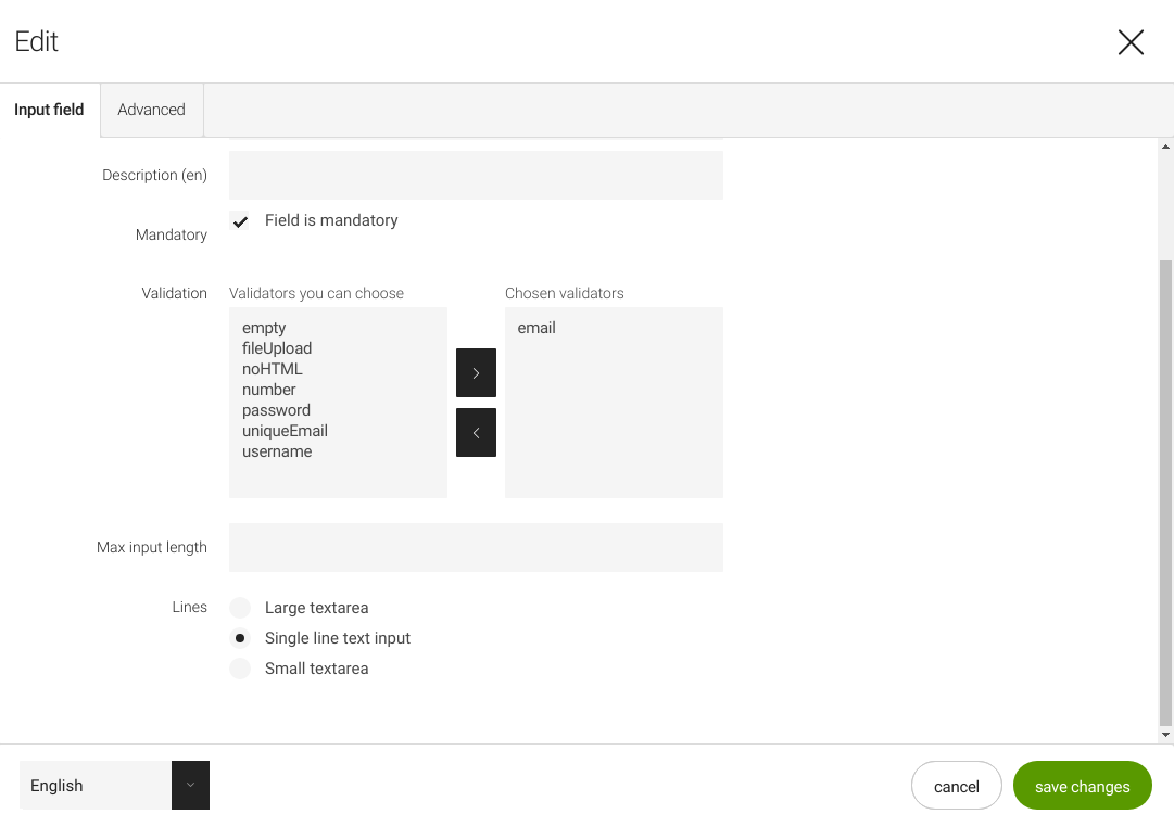
When field validation passes, the value is submitted. When field validation fails, the field is highlighted in red; when the user attempts to submit the form, a notification message identifies the problem.
Validators are configured in /modules/form/config/validators/:
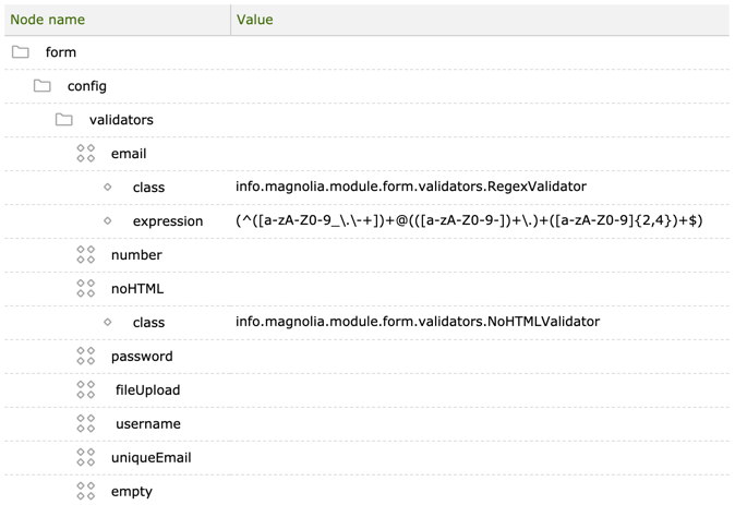
| Property | Description |
|---|---|
|
required Validator configuration node |
|
required Name of the validator. |
|
required Validator class that performs the validation. |
|
required/optional Available properties depend on the validator class. |
Validator configurations:
| Property | Description | ||||||
|---|---|---|---|---|---|---|---|
|
Value needs to be a valid email address.
|
||||||
|
Value needs to be a number, specifically an integer. No decimals separated with period or comma or fractions are accepted.
|
||||||
|
Value cannot any have HTML markup. This ensures that users can only enter plain text. Creating links and formatting text are not allowed.
|
||||||
|
Validates that the passwords entered into two password fields match. Used to eliminate typos.
|
||||||
|
Validates against a list of allowed MIME types and a maximum file size.
|
||||||
|
No validation. Used for the honeypot field only.
|
||||||
|
Verifies that the entered username does not exist in the system. This validator is added by the Public User Registration (PUR) module.
|
||||||
|
Verifies that the entered email does not exist in the system. This validator is added by the Public User Registration (PUR) module.
|
Form processors
Form processors configured in the module are responsible for sending submitted form data by email. The processors are executed when the form is submitted. The email content corresponds with the settings configured in the relevant tabs of the form component.
Processors are configured in
/modules/form/templates/components/form/formProcessors.
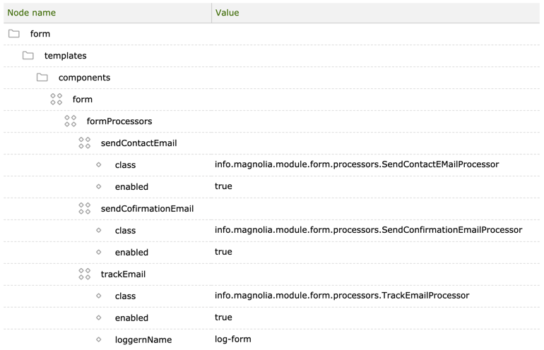
| Property | Description |
|---|---|
|
required Form processor node. |
|
required Name of the form processor. |
|
required
|
|
optional, default is Enables and disables the processor |
|
required The logger name. Only relevant for the |
Creating a custom form processor
The three example form processors above send the form data in email, but you can write a custom form processor to do almost anything. If you need to store the data in a database or process it in another way, write your own form processor. You can also try the Form2DB App that is a community developed app that saves form data via form processor into the JCR and allows for export to XLS.
Create a new form component definition for your custom processor. If you simply add the custom processor to the default component definition it will be executed for all forms.
For more examples, see form processors in the PUR module.
You can also create a form processor with server-side JavaScript.
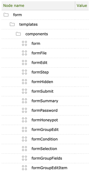
Form components
The form components are configured in
/modules/form/templates/components.
|
Logging form data
To log data sent in the contact form:
-
In the form component, check the Track mail checkbox in the Submit settings tab.
-
Enable the
trackEmailform processor. -
Submit a form.
-
To view the log:
-
Go to Tools > Log viewer, select
magnolia-form.logand click View. OR -
Open
/webapps/<webappName>/logs/magnolia-form.login the file system.
-