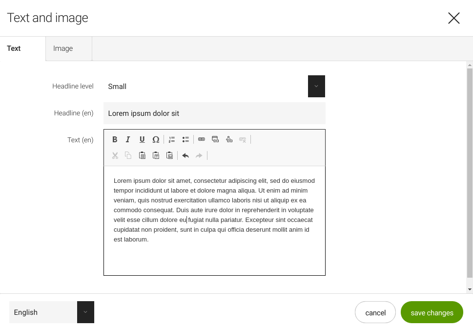
Rich text field - 5 UI
Deprecated
|
This rich text field definition has been deprecated since Magnolia 6.0. It is part of the Magnolia 5 UI framework. For the updated implementation, see Rich text field for Magnolia 6 UI instead. |
RichTextFieldDefinition renders a rich text editor. This is a
custom
Magnolia field that implements the CKEditor
component.
class: info.magnolia.ui.form.field.definition.RichTextFieldDefinition
fieldType: richText

Rich Text field properties
Simple rich text field definition:
form:
  tabs:
    - name: tabText
      label: Text
      fields:
        - name: text
          fieldType: richText
          tables: true
          height: 500
          label: Text Editor
Referencing fields shortcut info - 5 UI
See Referencing fields for further information.
| Property | Description | ||
|---|---|---|---|
|
optional, default is Text alignment for paragraphs. When set to |
||
|
optional Colors displayed in the color selectors. Comma-separated a string of
hexadecimal color codes without the |
||
|
optional Location of a custom CKEditor configuration file,
e.g. The default configuration files can be found in
A custom configuration allows you control over the
|
||
|
optional List of font names displayed in the Font selector in the toolbar, for
example CKEditor documentation for more. |
||
|
optional List of fonts size displayed in the Font selector in the toolbar, for
example |
||
|
optional, default is `300` The height of the editing area, including the toolbar, for example
|
||
|
optional, default is Allows images to be added from the DAM. When set to |
||
|
optional, default is Allows bulleted and numbered lists. When set to |
||
|
optional, default is Allows toggling between text and HTML editing. When set to |
||
|
optional, default is Allows tables to be added. When set to |
||
|
optional, default is List of validators configured globally in the global field validators configuration. See Field validators. |
Common field properties - 5 UI
| Property | Description | ||
|---|---|---|---|
|
required Defines the field type via either a field alias name or a fully-qualified field definition class name. See Field definition: Field types. To check the correct form of the name, use the Definitions app. |
||
|
optional Pre-filled default value displayed in the field. The value can be overwritten by the user. Use alphanumeric characters.
|
||
|
optional Help text displayed when the user clicks the help icon. The value can be literal or retrieved from the message bundle with a key. Use alphanumeric characters in literal values. Not applicable to the static field. |
||
|
optional, default is Enables i18n
authoring support which allows editors to write foreign-language or
regionally targeted content. A two-letter language identifier (en, de,
fr etc.) is displayed on controls where |
||
|
optional, default is the message bundle defined in the dialog definition_ Message bundle such
as |
||
|
optional Field label displayed to editors. The value can be literal such as
If you do not provide the property, Magnolia will fall back to a generated i18n key and display the key in the UI. If you do not want a label at all, define the property and set its value
to a blank space such as |
||
|
optional, default is the name of the field’s parent node_ Name of the node where the value is saved. The name |
||
|
|||
|
optional, default is Makes the field uneditable. Adding this property has the same effect as creating a static field. |
||
|
optional, default is Makes the field required (mandatory). An asterisk is displayed next to the field label. See also Checking for null values. |
||
|
optional, default is Error message displayed when required is true and the user saves an
empty field. The value can be literal or retrieved from the
message bundle with
a key such as |
||
|
optional Adds one or more style names to this component. Multiple styles can be
specified as a space-separated list of style names such as
|
||
|
optional Property transformer classes define how field values are stored in the repository. Each field has a default transformer class. You don’t need to define a class unless you want to override the default. The value is a fully-qualified class name.
|
||
|
optional, most fields set a default value automatically JCR property type of the stored value such as |
Link buttons
There are three link buttons:
-
 Links to external pages
 -
 Links to internal pages
 -
 Links to documents in
the DAM
Loading order for custom configuration
Any configuration done in RichTextFieldFactory
will override configuration settings from the config.js file. This is
why we ignore other properties in the field definition as soon as a
configJsFile is configured.
|
Decode text
CKEditor produces HTML such as <p> elements for paragraphs. However,
text stored in JCR usually escapes HTML code. To render text which
originates from a rich text field you need to decode the stored content
to make sure the HTML tags are rendered properly again.
Decode the content object and then get the desired property from it:
${cmsfn.decode(content).text!""}See
cmsfn
decodeHtml.