Icons
Icons add visual value to apps and actions. They help users instantly recognize user interface elements. Icons also add familiarity when used consistently across Magnolia.
|
In Magnolia 6.0+, you can not use icons for apps in app launcher anymore. Instead, an app icon must be a file in the SVG image format. See the How to add SVG icons for apps page for more details. |
Font-based and image-based icons
In Magnolia 6.x, the icons used come in two forms:
-
As font characters from the pictographic
MagnoliaIconsfont. -
As SVG Scalable Vector Graphics images.
The font-based icons are a vector format rather than a bitmap, which means you can style the icons with CSS and display them in various sizes without repeating the asset itself.
The image-based icons are used:
-
In the App launcher.
-
With the app items on the Find Bar search results list.
-
In the first tab of every app.
If you are developing a custom content app, you can also provide and use custom SVG icons in it. See the How to add SVG icons for apps page for more details.
Icon sizes
Icons are displayed in the following sizes in the user interface.
| Size | Description | Sample |
|---|---|---|
15 px |
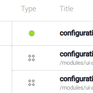
Search results list |
|
20/30/35 px* |
App launcher |
*Depending on the viewport size. |
16 px |
Action bar |
|
20 px |
Tab |
|
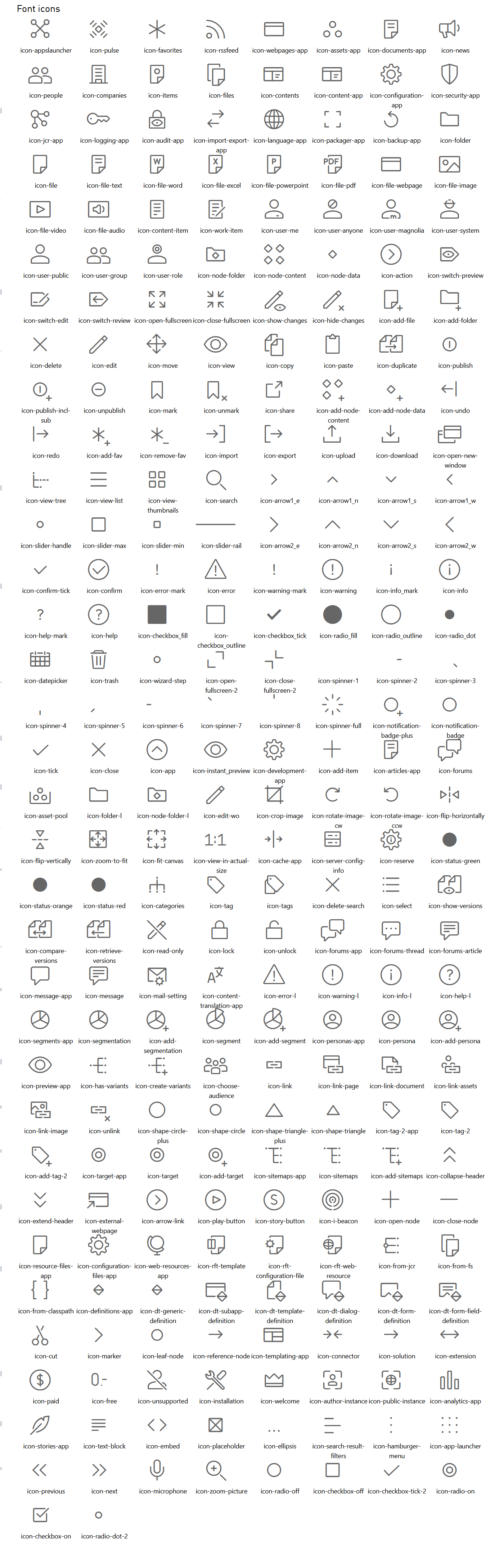
Image icons
To see the SVG image-based icons, see SVG App Icons Gallery.